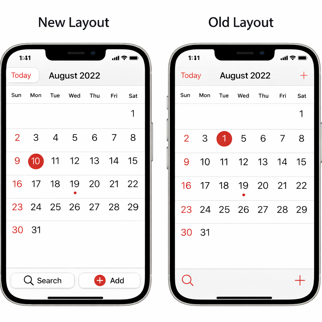
Apple’s upcoming iOS 27.3 update brings fresh design tweaks to the Calendar app, shifting several key controls to the bottom of the screen to improve ergonomics—especially for one-handed usage. These changes rolled out with iOS 27.3 beta 2, aiming to make navigating and managing events more accessible.
Interface changes focused on reachability
Under the new layout, the buttons for searching and adding events no longer sit at the top right of the Calendar app. Instead, both have moved to the bottom part of the display. This alteration makes them easier to reach, particularly on larger iPhones or when using the device with one hand. Previously, accessing these functions required more stretch or two-handed grip, which often proved inconvenient for many users.
Another shift involves the month and year display. Apple has repositioned the current month along with the year to the upper center of the screen. With this change, the year is removed from the back button in the top left, since it’s now always visible in the newly prominent header. This cleans up the top navigation bar and ensures users can instantly see both the month and year at a glance.
Smarter “Today” button and layout polish
The “Today” button, which returns you to the current date, also got a redesign. Instead of simply reading “Today,” it now explicitly shows the date—for example, “Mon 16”—making it clearer what selecting the button will do without needing to open the calendar view. This helps orient users quickly when they’ve jumped ahead days or months and want to return to the present day.
Overall, while these updates are relatively subtle, they reflect Apple’s ongoing push to streamline its apps’ user experience. They make high-use functions more accessible, improve visual hierarchy, and reduce unnecessary visual clutter—all steps toward more efficient day-to-day interaction.
Analysis: These changes may seem modest, but their impact in daily use could be significant. Moving frequently used actions like search and new event creation to the bottom puts them where thumbs naturally rest—potentially reducing taps and frustration. The always-visible year helps avoid mis-clicks or confusion when navigating across dates. For users of larger devices or those who prefer one-handed modes—or anyone who frequently flips between dates—these updates could streamline workflow. It’s worth watching if Apple will roll this design language into other apps. Users moving from older Calendar versions will want to acclimate to the shifted layout, but overall this feels like a smart usability win in iOS 27’s evolution.