Google is now expanding its Noto 3D emoji set beyond just Pixel phones, introducing fresh design insights as the rollout spreads to more Android devices and partner ecosystems. The company published a detailed breakdown of the visual philosophy behind the 3D emojis, explaining how artist choices were carefully tailored to balance realism, recognizability, and emotional impact. Early Android 17 devices from multiple manufacturers are now seeing the update live.
Design Ethos: Emotion Over Realism
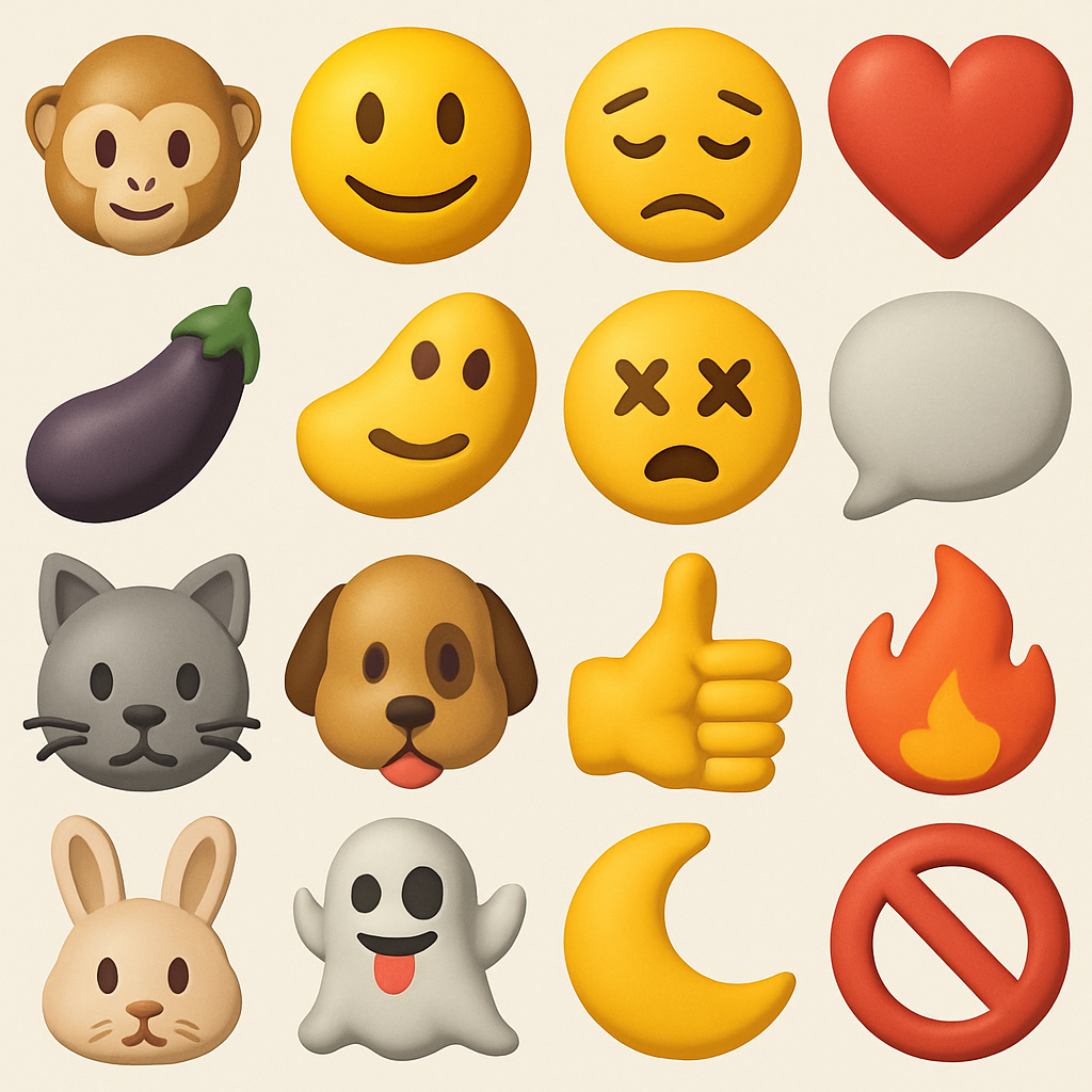
The design team responsible for Noto 3D started by evaluating every character by hand, choosing traits that give shape its character without turning symbols into near-photographic renderings. The priority was emotional clarity rather than anatomical precision. For instance, highly detailed features like irises or elaborate nostril structures were eliminated because they were shown to slow down a viewer’s ability to detect emotion. Similarly, excessive props or textures were found to clutter tiny thumbnails — particularly at the emoji scale, often 18×18 pixels.
To maintain readability and emotional impact even on small screens, each emoji is limited to just three essential visual elements. Details beyond that were deemed likely to muddy the communication. Even the decision over silhouette played a role: earlier versions like the raccoon emoji were adjusted so the character’s full form — stance, posture, limbs — could express intent and personality, not just floating heads or disembodied faces.
Rollout Scope and What to Expect
What began as a Pixel-focused release has now broadened significantly. In addition to Google’s own app suite and Android builds, the Noto 3D pack is arriving on devices from Nothing, Lenovo, Xiaomi, OPPO, OnePlus, realme, vivo, iQOO, HONOR, TECNO, Infinix, itel, and Motorola. The full library of new emojis is accessible via Google’s dedicated Noto 3D page.
Users can expect to see emoji redesigns that feel more sculpted, with full animal silhouettes, cleaner facial design, and minimized details that add style without sacrificing clarity. These changes apply not only to brand-new designs but also to updates of existing emojis to better match the new visual standards.
Google’s move toward 3D emoji reflects a larger trend in digital communication: finding middle ground between visual richness and fast, intuitive legibility. As visual content becomes ever more central to messaging, users demand symbols that punch through clutter — still fun and expressive, yet instantly decoded. For competitors, the benchmark has shifted: beyond flat design, it’s now about piecewise realism, silhouette integrity, and emotional resonance. What to watch: how third-party apps handle compatibility, whether these emojis carry over in custom keyboards and cross-platform messaging, and how design standards influence future iconography in mobile UIs and interfaces.