The New York Times has updated its iOS application to incorporate Apple’s Liquid Glass design, enhancing the app’s visual appeal and aligning it with the latest iOS aesthetics.
Introduced with iOS 26, Liquid Glass is a design language that emphasizes transparency and depth, offering a more immersive user experience. Since its debut, various applications have gradually adopted this design to stay current with Apple’s evolving interface standards.
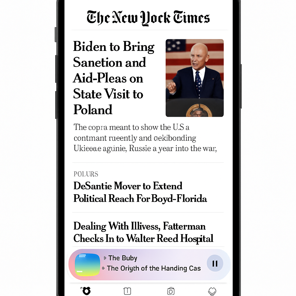
In the latest update, the New York Times app has applied the Liquid Glass effect to its main navigation tab bar and the mini audio player. This selective integration allows the app to maintain its unique visual identity while embracing modern design elements.
Such a minimalist approach to adopting Liquid Glass is common among major iOS applications that prefer to retain their established interfaces without extensive redesigns. By incorporating these subtle changes, the New York Times app enhances user experience without compromising its familiar look and feel.
Other notable applications have also embraced Liquid Glass recently. For instance, iA Writer 8 introduced a refreshed interface with Liquid Glass design, clear icon support, and additional features. Similarly, Microsoft updated Outlook for Mac with an app-wide Liquid Glass overhaul, and Pocket Casts integrated the design into its podcast player app.
As iOS 27 approaches, it’s anticipated that more applications will adopt Liquid Glass to provide users with a cohesive and modern interface. This trend underscores the importance of staying updated with design innovations to meet user expectations and enhance engagement.
The New York Times app’s adoption of Liquid Glass signifies a broader movement among developers to align with Apple’s design evolution. Users can look forward to a more visually engaging experience as more applications integrate these design principles.