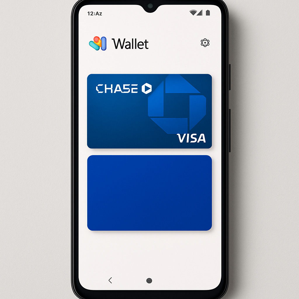
Google is quietly testing a redesign of the Wallet app on Android that swaps its horizontal carousel of payment cards for a vertically stacked list. Instead of swiping left and right among saved credit, debit, and loyalty cards, users now see one card in full view with a sliver of the next above it. The full details of each card, including transaction history, are tucked behind a gear icon in the upper-right corner. While the new design isn’t fully rolled out, more Android users, particularly outside the U.S., have started spotting it.
What’s Changing vs. What Stayed the Same
Until now, Wallet’s card interface has shown cards in a horizontal carousel at the top of the app, revealing just a peek of adjacent cards. That setup allowed users to reorder cards, set a default payment method, and share passes on the homepage. The new vertical stack replaces all that. You tap or swipe down to extend the stack into a full-screen view and select a card to pay.
However, accessing card details and transaction history now takes an extra tap. You’ll need to reach up to the settings gear icon in the top corner — a less streamlined path than before. Previously most functions—reordering cards, setting defaults—were more immediately available directly from the carousel view.
Why Google Did It & What Users Are Saying
The vertical layout bears similarities to Apple Wallet’s design in how cards are listed, though Google’s version aims to show more of the card art in previews. Users with multiple stored cards stand to gain the most, since the full list becomes easier to browse without horizontal swipes. One-handed use is also improved, with core controls likely positioned lower in reach. Still, some find the new layout cumbersome—especially when trying to reach the gear icon all the way at the top.
Feedback first showed up via Reddit reports and international users, suggesting the rollout is still gradual and region-dependent. Some see it as catching up to patterns seen in Samsung Wallet or Apple’s app, while others see the change as ill-advised for those who preferred the carousel’s quick-access layout.
As of October 6, 2026, Google confirms that the stacked redesign is not yet widely available—its appearance seems tied to server-side changes rather than a full app update. More devices are seeing it, but it remains in transition.
This change follows on top of other recent design tweaks to Google Wallet, including updates to the homepage and fullscreen passes view earlier this year. These efforts suggest Google is steadily rethinking how much information and control users should have at a glance vs. through deeper menus.
What to Watch Moving Forward
Will Google address the top-heavy gear icon placement? Will they allow optional toggles to revert to the carousel layout? How quickly will users in the U.S. see access, and will there be any performance or accessibility trade-offs for older devices? If feedback is strong, Google may refine or even roll back certain elements. That makes this redesign a litmus test for how much UX change users will tolerate in their payments apps.
In a broader sense, this signals Google is aiming for better usability across its apps—less reliance on reach zones for common tasks, more visual consistency. But it also reminds us that redesigns risk disrupting muscle memory. Those changes will only stick if they’re both discoverable and sensible.
What matters now is how Google listens—and whether its Wallet redesign finally balances visual polish with speed and efficiency.