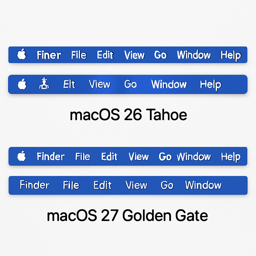
Apple’s introduction of icons for every menu item in macOS 26 Tahoe faced significant criticism for being both aesthetically displeasing and detrimental to usability. This design choice contradicted Apple’s own human interface guidelines from 1992, which advised against such practices, describing them as “ugly, unpleasant, distracting, illegible, messy, cluttered, confusing, and frustrating.”
In response to the backlash, Apple has corrected this design in the upcoming macOS 27 Golden Gate. The company has also updated its guidelines to emphasize the judicious use of menu item icons. The revised guidelines state: “Use menu item icons sparingly and with purpose. Icons allow people to find menu items more quickly, and help clarify what selecting an item does. Use an icon to highlight the most common actions and key features of your app, file system locations, connected devices, visual concepts like rotating or flipping an image, and user-generated content like folders and documents. Don’t display an icon if you can’t find one that clearly represents the menu item.”
Commenting on this development, John Gruber remarked that it indicates a positive shift within Apple’s software design team, suggesting that previous design missteps are being addressed and corrected.
This course correction underscores the importance of adhering to established design principles to maintain user-friendly interfaces. It also highlights Apple’s responsiveness to user feedback and its commitment to refining the macOS experience.
Source: 9to5Mac