The Shazam app for iPhone has just rolled out an update that tweaks its visual style and adds a fun way to spice up your messages. Though the changes are relatively small, they offer a glimpse into how developers are refining user experience in everyday apps.
Softer Icon, SticKy Add-ons
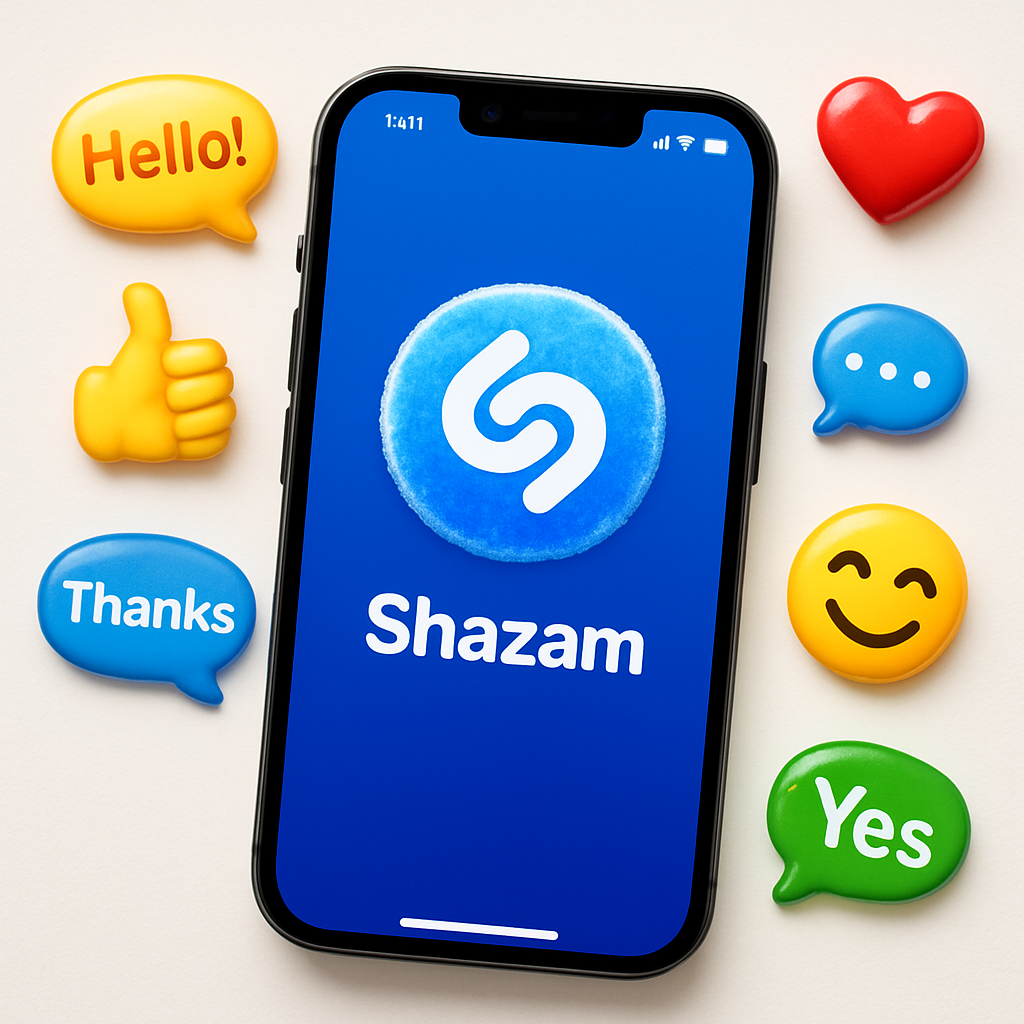
One of the visible changes is a slight refresh of the app icon. It now features a subtler, frostier finish — still unmistakably Shazam, but smoother and a touch more modern. The adjustment isn’t dramatic, but it gives the app a refined edge.
Meanwhile, the update introduces a brand-new set of iMessage stickers tied to Shazam. Users can now open these stickers by tapping the plus symbol in a Messages thread, selecting ‘Stickers’, choosing Shazam’s icon, and then sending the graphic of their choice. The stickers also work during FaceTime video sessions and any app that supports the emoji keyboard.
Why This Kind of Update Matters
Small visual updates like a polished icon help apps stay fresh in a crowded household of home screens. Consistency and recognizability are vital, especially for apps people launch often—like Shazam, which turns song discovery into a habit.
Additions like stickers aren’t strictly functional, but they tap into how people communicate today. Messaging, video calls, emoji, and stickers are parts of daily expression; by supporting them, apps become part of daily digital life, not just tools.
This update doesn’t change core features — it doesn’t affect song identification, music detection, or discovery mechanics — but these design tweaks play a role in preserving brand presence and boosting user engagement in smaller, often overlooked ways.
Analytical Take: This update may not grab headlines, but it reflects a broader pattern in app development: incremental improvements to interface and interaction, rather than sweeping feature releases. In a time when users expect fluid visuals and playful communication options, changes like Shazam’s frosted icon and sticker integration keep the app relevant and engaging. Going forward, watch for more apps leaning into these cameo-style upgrades — they might seem minor individually, but collectively they reshape how we interact with our devices daily.