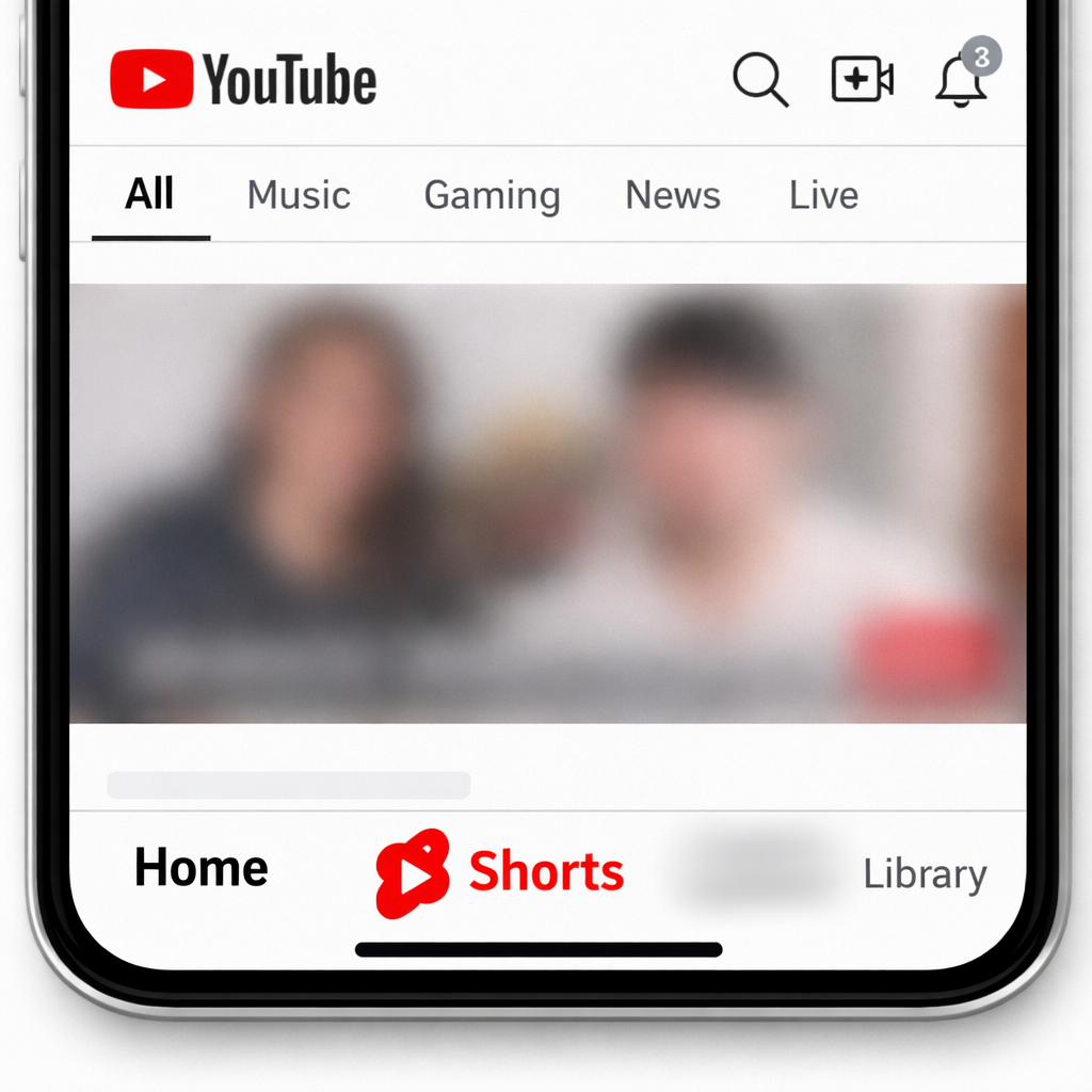
YouTube has started rolling out a major redesign of its mobile app that does away with the long-established Subscriptions tab—marking the biggest navigation change in about a decade. The new layout promotes content like Shorts and creator tools more aggressively, while the refreshed Home tab now combines recommendations, subscription content (now labeled “Subs”), and more. For many users, this swap in priorities feels like a betrayal of muscle memory. The Subscriptions tab isn’t gone entirely—it’s simply been moved behind the Home tab and no longer has its own permanent spot in the bottom nav bar.
While the shift hasn’t changed what users can do—Channels, subscribed content, and other familiar features remain accessible—the removal of a dedicated Subscriptions button breaks up decade‐old patterns. The redesign appears to be rolling out from the server side rather than through a new version of the app. Most Android users have the update now; iOS users are starting to see it, too.
User Backlash Hits Hard
The initial reaction has been overwhelmingly negative. On platforms like Reddit, users have called the redesign “sloppy,” “disgusting,” and said it’s the worst UI Google has made. Many people feel the change reflects what the company wants users to do—consume new content—rather than what users want to do—which for many users is to simply catch up on uploads from the channels they’ve subscribed to. The disappointment isn’t just reactionary: it’s tied to how ingrained the Subscriptions tab has become over years of usage.
One of the few new perks is a customization feature within the Home tab that allows users to craft a “custom feed.” But for many, that’s a thin consolation when the cost of losing the dedicated Subscriptions access feels so high. The emotional weight behind the backlash stems from being forced to adjust habits that users didn’t ask to change.
What’s Changed — And Why It Matters
Previously, YouTube’s mobile interface included five bottom navigation icons—Home, Short Videos (“Shorts”), Explore, Subscriptions, and Library. That bottom bar is now reworked to put a heavier spotlight on Shorts and content creation tools, downplaying the importance of subscriptions. Although there remains a way to view content from subscribed channels, that content now lives deeper in the Home tab instead of having its own corner of the interface.
This isn’t the first time YouTube has shuffled its layout, but the simplicity and reach of the Subscriptions tab has long been a core way users managed their feed. By hiding it behind another tab, YouTube appears to be betting that algorithmic discovery and Shorts will drive more engagement than subscription-based viewing.
Why this matters: Navigation and UI structure shape how we use apps every day. Subscriptions have represented control and predictability—what you’re choosing to follow—while recommendation systems often drive clicks but not always satisfaction. When a platform deprioritizes user intent in favor of content it thinks users ought to see, trust can erode.
What to watch: Whether YouTube will tweak this design in response to complaints. Whether creators whose reach depends on subscription notifications and feed visibility will push back. And whether rivals seize this moment by promoting clearer subscription-first features.