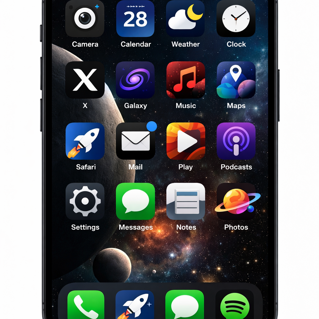
The X app for iPhone and iPad has rolled out a fresh batch of alternate icon designs—over a dozen new options—expanding what users can pick beyond the familiar black “X” logo. This is the most significant refresh of the app icon set since the Twitter rebrand to X a few years ago.
Originally, changing X’s icon was a feature tied to the Twitter Blue subscription (now rebranded as X Premium). Subscribers previously had access to seasonal icons as well as variations that included space motifs, but those offerings hadn’t been substantially updated until today.
What’s New in Icon Options
With today’s app update, the icon selection under Settings > Subscription > App Icons has been overhauled. The refreshed lineup includes more options inspired by cosmic or space themes, alongside designs that give more visual flair beyond the standard X or Twitter logo alternatives. Users now have a broader range of styles to customize how the app appears on their home screens.
This release replaces the previous icon set entirely. Where once the icons included the classic Twitter bird, seasonal designs, and a handful of alternate visuals, now it’s all about newer, bolder designs aimed at variety and personalization. The black X remains among the defaults, but much of what was available before has been swapped in favor of these new choices.
Access & User Impact
If you’re an X Premium subscriber, getting the new icons is simple: open the X app, then go to Settings > Subscription > App Icons. From there, you can browse and select from the updated collection. Non-subscribers won’t see the new designs as changing the icon is still a Premium-only feature.
This change reflects how X is leaning further into personalization—allowing users more control over how their app looks—which is increasingly common across mobile platforms. Small customizations like these can help an app feel more personal, which may improve user satisfaction among devoted subscribers.
This icon refresh is timely: since the rebrand from Twitter to X, few meaningful aesthetic updates have been made to the icon set. For those who’ve stuck with the classic icons or seasonal ones, this update provides a new reason to revisit settings. For new users, it signals that X Premium is also about style and not just features like posting privileges or profile upgrades.
Why it matters: in a crowded social media market, even seemingly minor features like icon design can help a product stay top-of-mind. With icons that stand out, users are more likely to engage or feel invested in the app. What to watch for next: whether these icon changes are followed by more visual theming options—such as customizable app colors—or deeper UI overhauls that let users further tailor the experience.