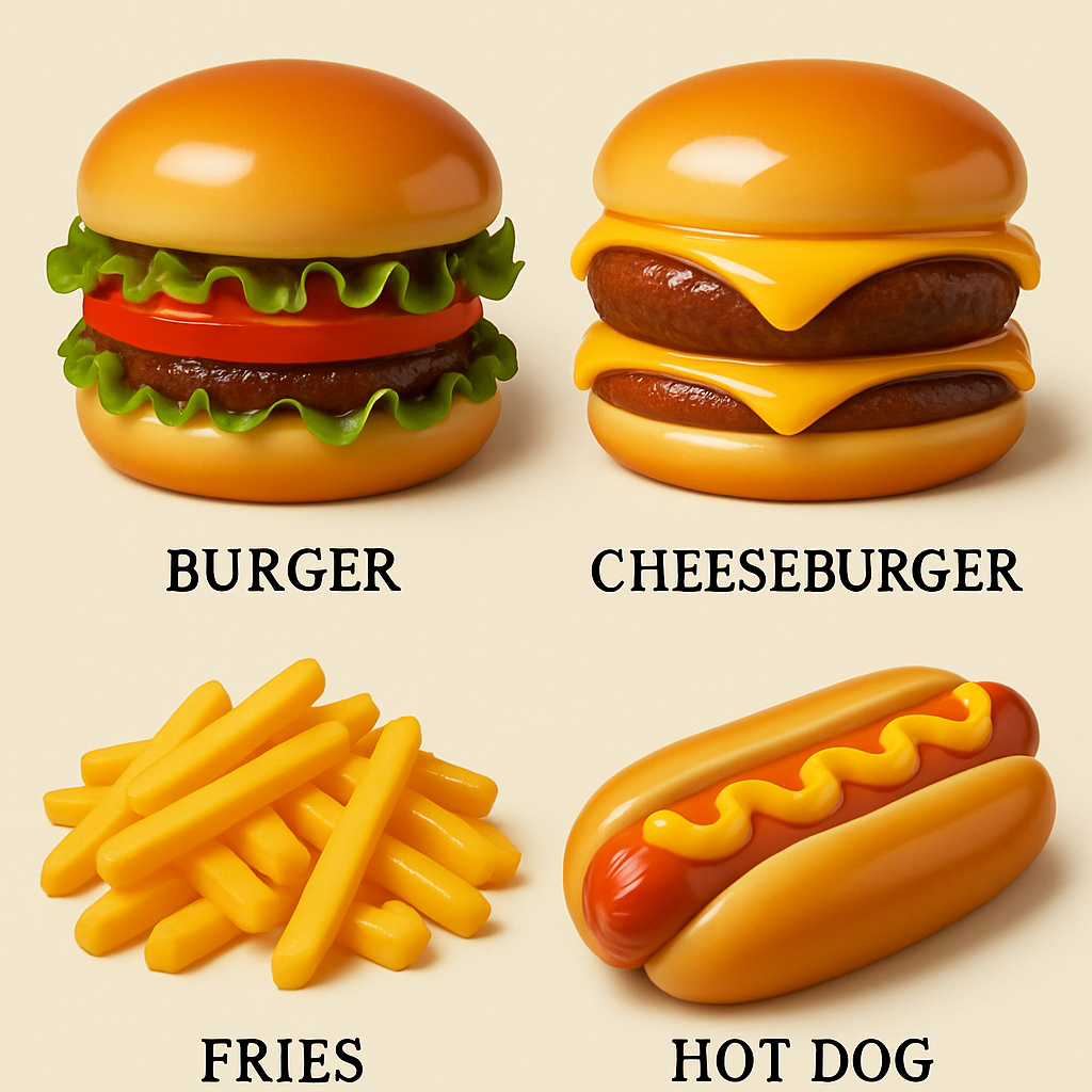
Walk into a local café and glance at their menu. The bagel sandwiches, burgers, tacos—all look sharp, symmetric, even unnaturally flawless. You’re noticing something off. What’s happening is a creeping uniformity in visuals produced by generative AI tools, especially in food menus: food images and illustrations that look almost perfect, but wrong in ways you can’t pinpoint.
Generative AI platforms—image diffusion systems and large language models trained on massive visual and text datasets—seek out aesthetic patterns deemed “pleasing.” The problem is those ideals skew toward a narrow, polished look. When a user asks something like “design a burger restaurant menu,” these models draw from hundreds of similar chain-restaurant menus. The result: homogenized layouts, generic typefaces, idealized photos that miss texture, irregularity, and authenticity.
How “Perfect” Becomes Disturbing
Part of the issue stems from how AI models are trained. The datasets include lots of professionally shot food photography and polished ads, leading the models to favor symmetry, cleanliness, and ideal lighting. As one researcher put it, everything ends up looking like a Chili’s or McDonald’s layout from mid-2010s—familiar, but stilted. When images reflect these idealized templates, realism suffers.
Another factor is “convergence,” where models repeatedly absorb and re-process images produced by earlier AI systems. As this feedback loop grows, it causes outputs to smoothen out more; any small detail gets erased or rounded off. Some users experience this even more acutely when repeatedly editing a menu image: after dozens of tweaks, the food starts to look overly rounded, overly clean—too neat to be appetizing.
Uncanny Valley & Consumer Discomfort
There’s psychological research behind why audiences often feel uneasy about these images. At a university in Germany, scientists found that food visuals generated by AI that are almost realistic—but not perfect—trigger stronger aversion than ones that are obviously fake. The more an image falls into that unsettling zone, the more it disturbs.
For restaurant operators using AI-designed menus, the payoff might seem appealing: fast, cheap visuals. But when patrons feel something is off—even if they can’t say why—it undermines trust. That uncanny feeling may fuel backlash against AI usage in hospitality, just as people spot and criticize menus that look polished but lifeless.
This isn’t just about food menus, either. The same forces—dataset bias toward “pleasing” visuals, repeated reuse of AI outputs, smoothing out imperfections—play out in text, art, ads, product renders. As AI continues to permeate content creation, the risk is that everything starts to feel formulaic.
Analytically, this trend means businesses must be more thoughtful in using AI tools. While these systems offer efficiency, overreliance without human curation leads to bland sameness. Restaurants should experiment with authentic imagery—real or imperfect—give designers room to break from templates, and push back on overly polished norms. What will matter most is how well a menu (or any content) connects with real senses, giving audiences texture, authenticity, and personality rather than just aesthetic perfection. The visual imperfection might be exactly what makes the difference.