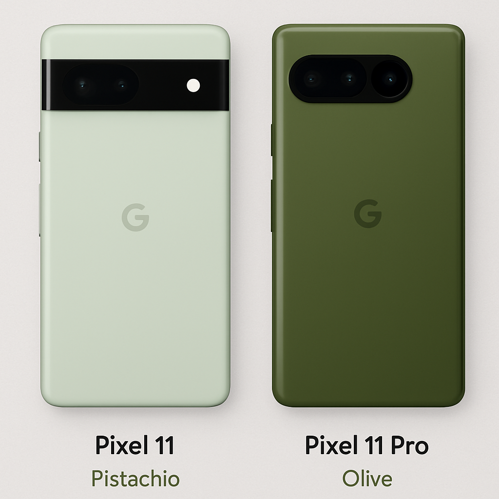
Google’s Pixel 11 series introduces a new color palette, with the base model featuring a shade named “Pistachio.” This hue, exclusive to the standard Pixel 11, has sparked mixed reactions due to its subdued appearance.
Historically, Google’s Pixel lineup has been recognized for its distinctive and vibrant color choices, reflecting the company’s unique design philosophy. The introduction of “Pistachio” continues this tradition but with a twist. Unlike the more vibrant greens seen in previous models, this shade leans towards a muted, almost desaturated tone, leading some to liken it to an “old avocado” rather than the bright green of a fresh pistachio nut.
In contrast, the Pixel 11 Pro and Pro XL models are available in a green variant named “Olive.” This color has been received more favorably, with its richer and more saturated green providing a striking visual appeal. The difference between “Pistachio” and “Olive” underscores the varied design choices Google has made across the Pixel 11 lineup.
Adding to the discussion is the design of the Pixel 11’s side rails. The base model features matte side rails, which some users prefer over the glossy gold-like sides of the Pro models. This design choice offers a subtle yet distinct aesthetic difference between the models.
Interestingly, the official case for the Pixel 11 in “Pistachio” presents a brighter and more vibrant green compared to the phone itself. This contrast has led some to speculate that a more vivid green for the device might have been a more appealing choice.
For consumers considering the Pixel 11, it’s worth noting that other color options are available, including “Hibiscus,” “Frost,” and “Obsidian.” These alternatives provide a range of choices for those who might find “Pistachio” less appealing.
As the Pixel 11 becomes available for pre-order, potential buyers are encouraged to view the color options in person or through high-quality images to make an informed decision. Color perception can be subjective, and what might seem muted to one person could be perfectly subtle to another.
In the broader context, Google’s experimentation with color reflects its commitment to offering personalized choices to consumers. While “Pistachio” may not resonate with everyone, it exemplifies the company’s willingness to push design boundaries. As the smartphone market becomes increasingly saturated, such unique design choices can set a brand apart, even if they occasionally miss the mark for some users.