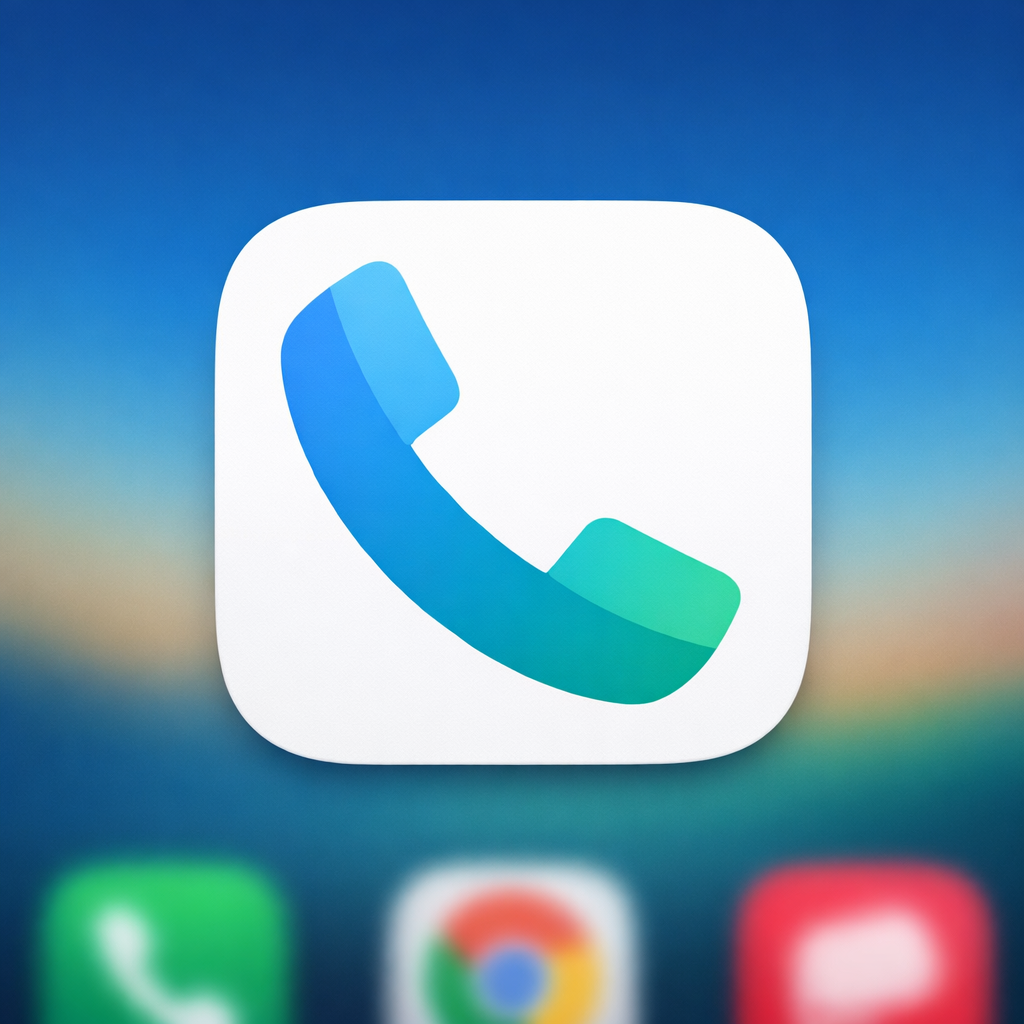
Google is rolling out version 246 of its Phone app—still called Phone by Google—to Android users, introducing a refined gradient icon that aligns with the company’s modern visual identity. The update is hitting devices via the beta channel now, with a stable release expected in the coming weeks. Following similar changes to Messages, this refresh focuses purely on icon design with no functional adjustments.
What’s Different in the New Icon
The updated icon features a larger handset silhouette compared to previous versions, though the overall shape remains familiar to avoid confusion. The redesign drops the darker blue tones entirely, opting instead for lighter shades with soft gradients in the earpiece and mouthpiece. The result: a flatter, cleaner appearance designed to feel sharper on home screens.
Design Alignment & Rollout Details
This update continues Google’s recent efforts to harmonize app visuals across its ecosystem. New color, spacing, and gradient choices take cues from other Google tools, aiming for a more seamless look among core apps. Users can spot the changes first in the beta release; those in the stable channel should see the update within a few weeks. Contacts and Messages are still awaiting their stable updates featuring similar design tweaks.
The change has already appeared in the stable build of Phone by Google version 246 in some regions, though most users will get it through beta first. There are no other modifications in this build beyond the icon overhaul.
Why It Matters: App icons are subtle cues of brand identity. Even a minor redesign like this signals Google’s push toward a unified, polished look across Android. For Pixel owners especially, where interface cohesion is highly visible, this kind of update can sharpen the overall feel of the system. Keep an eye out for how quickly the stable build reaches your device—it will indicate how confident Google is in this visual direction.