Apple’s latest iOS 27 Beta 5 introduces a series of design refinements, notably updating the icons for several native applications to align with the Liquid Glass aesthetic. This update enhances the visual coherence and modernity of the user interface.
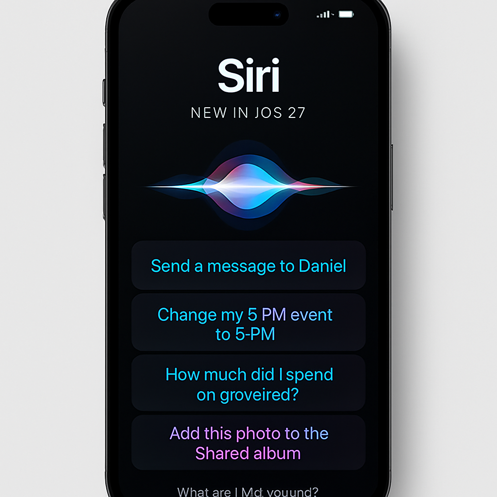
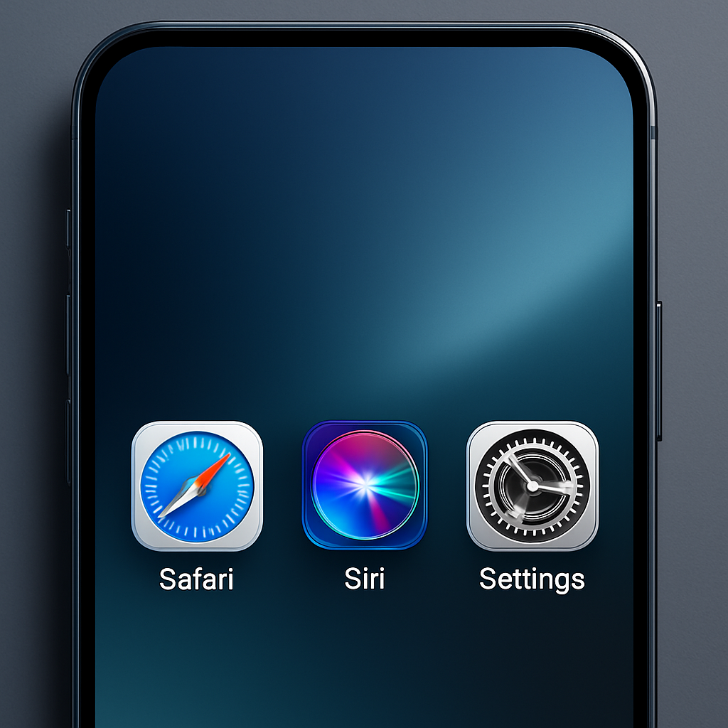
The Safari icon now features a more vibrant blue hue with detailed compass lines and arrows, offering a clearer and more engaging visual. The Siri icon has been redesigned to closely resemble the dynamic Siri waveform displayed during activation, providing a more intuitive representation.
The App Store icon has increased translucency, making the ‘A’ symbol more distinct. Similarly, the Settings icon incorporates additional translucency, contributing to a sleeker appearance. The Preview app undergoes a significant transformation, now showcasing a magnifying glass over a colorful backdrop, adding depth and visual interest. The Remote app icon has been updated with a gray background, replacing the previous black, and includes more intricate detailing.
These updates build upon earlier changes introduced in the initial iOS 27 beta, which revamped icons for Maps, Photos, and Weather. Apple has indicated plans to continue refining app icons to better integrate with the Liquid Glass design language, suggesting that further updates may be forthcoming in subsequent beta releases.
With the official release of iOS 27 anticipated in approximately a month, these design enhancements reflect Apple’s ongoing commitment to evolving its user interface. By refining app icons to align with the Liquid Glass aesthetic, Apple aims to provide a more cohesive and visually appealing experience for users. This iterative approach underscores the company’s dedication to design excellence and responsiveness to user feedback.