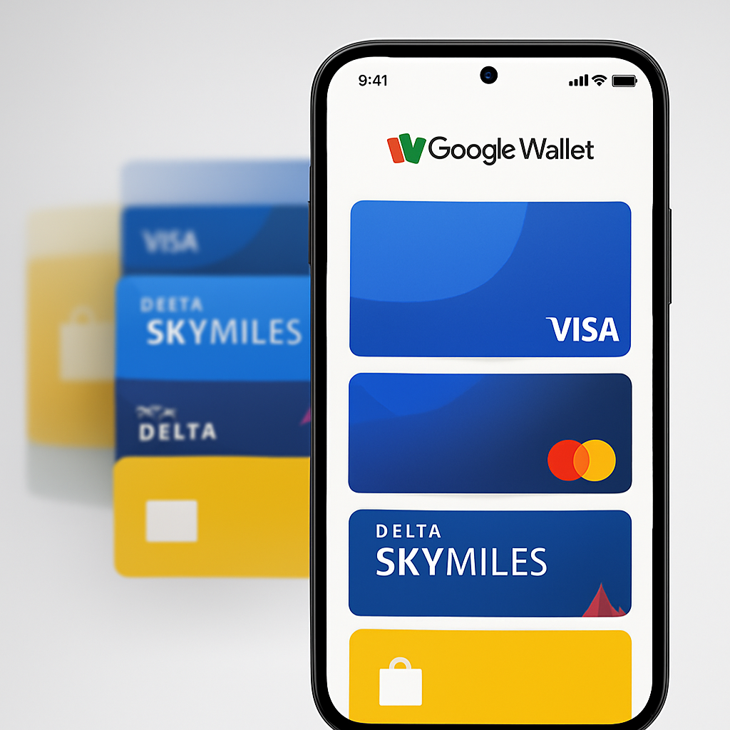
Google Wallet on Android is getting a noticeable makeover. Rather than the familiar horizontal carousel of credit and debit cards, users are now seeing a vertically stacked list—a shift reminiscent of iPhone’s Wallet layout. This change appears mostly among international users so far and reshapes how passes and payment methods are accessed.
What the UI looked like before vs. what’s changing
Up until now, Google Wallet showcased saved cards with a carousel-style interface along the top of the screen. Users could swipe horizontally to flip through cards, seeing partial previews of adjacent ones on each side. It also let them reorder cards and set a default payment method. Passes like tickets or boarding passes shared this same top section of the homepage.
The updated design drops the carousel for a vertical card stack. Cards are now lined up in a list; the full designs are more visible than before, and navigation is more thumb-friendly—especially when a frequently used card is placed toward the bottom.
Where and when it’s rolling out — and what people are saying
Reports suggest the vertical stack update began appearing over a recent weekend, mainly among users outside the U.S. The change has stirred a mixed reaction. Some appreciate how it boosts visibility and ease of access, particularly for those with a lot of saved cards. Others compare it to layouts seen in Samsung Wallet and criticize parts of it as less intuitive.
One feedback point: the increased visibility of card faces—better designs, clearer branding—gets praise. Countering that, there are concerns about discoverability and how card reordering might work under the new system.
Why this matters
Payment apps are always hunting for enhanced usability—something like a layout tweak can make or break daily interaction. The old carousel is compact but often clunky if you’ve got many cards. For one-handed use, or people who juggle lots of payment and loyalty cards, a vertical list is often cleaner and faster.
Design language in mobile wallets is increasingly converging. Apple’s Wallet has long used vertical stacking; Samsung Wallet recently made headlines for its own card layout. Google’s shift shows how even big platforms are borrowing UI cues from each other—and suggests that users simply expect more clarity and less friction.
What to watch for: The rollout’s scope—will this become the default worldwide, or is it just a test? Also, how Google handles reordering and default card settings under the stacked layout will matter a lot. Finally, feedback so far is mixed enough that tweaks may come fast.