Google Unveils Bold Redesign of Workspace Icons for the Gemini Era
In a significant visual overhaul, Google has introduced redesigned icons for its Workspace suite, marking a new chapter in the platform’s evolution. This transformation aligns with the integration of Gemini-powered AI features across all Workspace applications, including the recent launches of Gmail Live, Docs Live, and an enhanced voice feature for Google Keep.
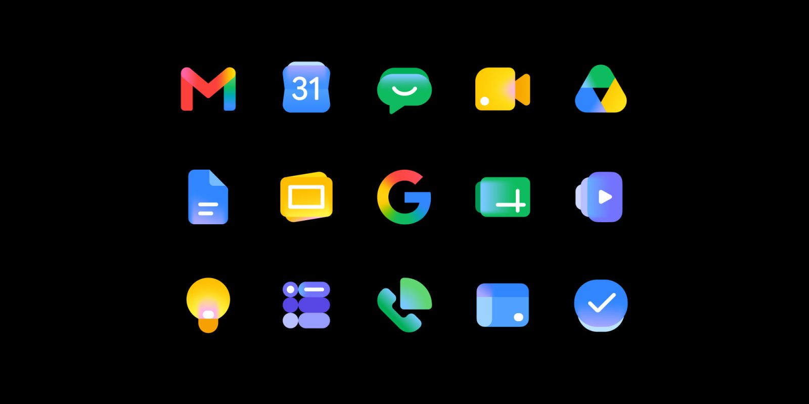
The updated icons were prominently displayed during the I/O 2026 conference, though they were not a focal point of the keynote address. Post-event, Google elaborated on the redesign through its @GoogleWorkspace Twitter account, stating that the icons have been given a sleeker look to meet this new era of helpfulness, referring to them as bold representations for the Gemini Era.
The primary objective of this redesign is to provide each application with a more distinct identity while maintaining consistency and cohesion across the product suite. This approach ensures that each app remains modern and easily recognizable on users’ screens.
Notable changes include the removal of the paper-like background containers from apps such as Docs, Sheets, Slides, Keep, Forms, Sites, and Vids. Additionally, the previously boxy designs of Calendar, Meet, and Chat have been refined. The earlier mandate for logos to incorporate all four Google colors has been relaxed, with Gmail being the sole exception.
Google has emphasized that these design updates do not alter any core functionality or administrative controls. The rollout of these updates is scheduled over the next several weeks, encompassing Gmail, Calendar, Chat, Meet, Drive, Docs, Slides, Sheets, Vids, Keep, Forms, Voice, Sites, and Tasks.
This redesign reflects Google’s commitment to evolving its visual identity in tandem with technological advancements, ensuring that its suite of tools remains both functional and aesthetically appealing in the rapidly changing digital landscape.