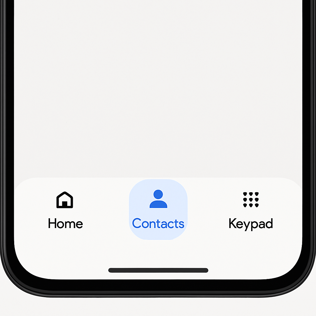
Google is bringing back the Contacts tab to the bottom navigation bar in its Phone app after removing it in favor of a simplified layout. This restoration aims to offer users direct, one-tap access to contacts from the main screen instead of hiding them behind a navigation drawer or within a favorites carousel. The change is rolling out now to beta testers.
Why It Was Removed in the First Place
In August 2025, Google revamped the Phone app’s bottom bar navigation, trimming it down to just three tabs: Home, Keypad, and Voicemail. During that redesign—which followed the Material 3 Expressive update—the Contacts tab was eliminated. Instead, users could reach their contact list via the navigation drawer or through a favorites carousel placed at the top of the Home feed. That layout generated some confusion among users who preferred persistent access to Contacts. The navigation drawer shortcut remained, but many found it less intuitive than a standalone Contacts tab front and center.
The Contacts Tab Returns
Over a year later, the Contacts tab is making its comeback, positioned between Home and Keypad in the bottom navigation bar. The navigation drawer shortcut for contacts is being removed entirely, while other access points—like the favorites carousel—remain in place. This change reflects Google’s response to user feedback and the recognition that access to one’s contact list remains one of the most-used features in a phone app.
The update is currently available to those running the Phone by Google beta version 240 or newer. It isn’t yet visible to all testers, as Google is rolling it out gradually to ensure stability and monitor user reactions.
This shift is relatively small compared to some major redesigns, but it touches on usability fundamentals: minimizing friction when reaching key functions. Restoring Contacts to the bottom navigation is a reminder that some UI changes, however modern, may need course adjustments based on real-world usage.