Google’s Pixel VIPs widget is getting a streamlined redesign that rolls out following the September Feature Drop. The update simplifies layout options and refines how you interact with your most important contacts.
What’s in the redesign?
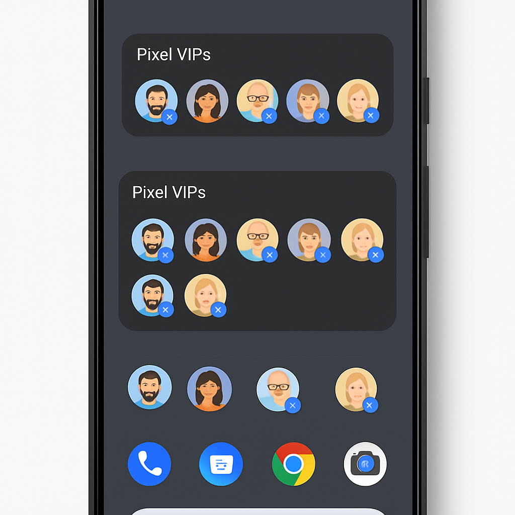
The first major change is that the widget no longer expands to full-screen. Instead, users get two fixed layouts: a 5×1 compact version and a taller 5×2 view. The compact 5×1 shows a single row of up to four prioritized contacts at a time, complete with circular profile icons and first names only—removing last names for cleaner visuals and consistency.
The larger 5×2 configuration is now the maximum size, displaying rectangular cards that pack in call and message buttons with pill-shaped tappable elements. When there are unread messages, you’ll see a circular badge on either the profile avatar or the messaging icon—though in the new card layout, this badge may be easier to miss.
How it’s arriving, and what it replaces
This redesign is being delivered via a server-side update, which means not every Pixel device has it yet. It’s already active on some devices but isn’t widely available. Earlier in the week the related “version 2.0” update also rolled out, bringing a full-screen-style view that replaces the previous bottom sheet for switching between VIPs, as well as tweaks to the content feed inside the VIPs area.
Previously, users could expand the widget across much more screen real estate. Under the old design, contact avatars came with full names, and the layout flexibly changed based on how many VIPs you had. Now, with the new constraints, Google is favoring uniformity and clarity over expansiveness.
It’s unclear yet when the redesign will hit all eligible Pixels or which models will be prioritized. The update follows Google’s regular Feature Drop schedule, which bundles new tweaks and fixes for Pixel devices on a monthly or quarterly basis. This one builds on changes introduced earlier—like the version 2.0 update—to refine user interaction.
Bottom line: The VIPs widget redesign delivers cleaner organization for contacts, sharper visuals, and more consistent behavior. It tames the expansive nature of the widget to make it more predictable and visually satisfying.
What this means: For everyday users, the shift toward more compact layouts and less visual clutter is a win—contacts feel more prominent without being overwhelming. For Google, this update signal an ongoing push to polish small UI elements that reinforce usability on Pixel devices. Watch for feedback on badge visibility and how early adopters perceive the layout constraints compared to the older widget’s flexibility. More tweaks could come based on how this redesign lands.