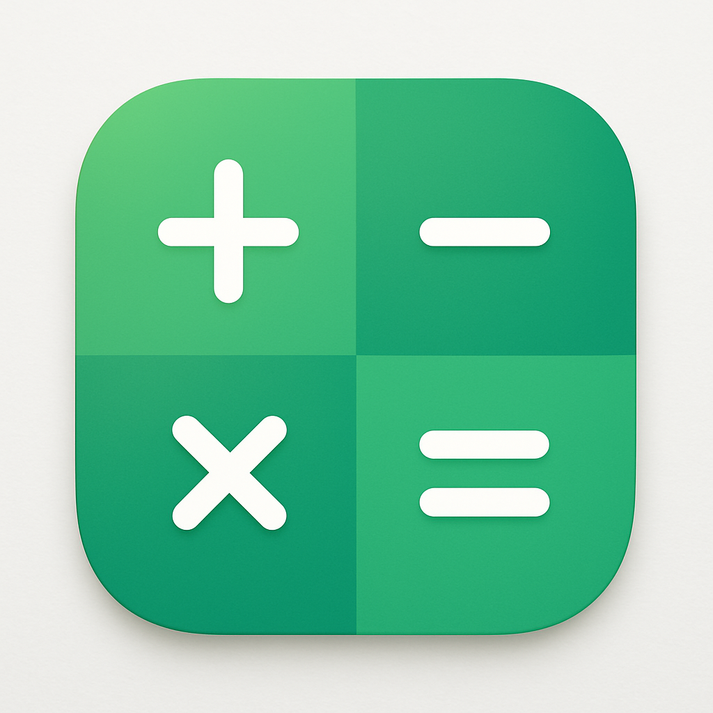
Today marks the rollout of a redesigned icon for the Google Calculator app on Android, as part of Google’s ongoing efforts to unify its app visuals under a gradient-based design language. The update, tagged on version 9.3 of Calculator, mirrors recent changes across several other first-party apps in the Google and Pixel ecosystem.
What’s Changing?
The updated icon swaps out its old look for a clean white background and refreshes its symbols—the plus, minus, multiplication, and equals signs—which are now placed inside softly rounded shapes. The equals sign stands out in a lighter shade than the other operator symbols. The overall design closely resembles Google’s Quick Settings tile icons introduced a while ago. Green themes the new icon’s color palette, contrasting with the prior gray-blue scheme. No other features or functionality were altered in this release. No added bells, just a smoother, more consistent design.
How This Fits Into Google’s Bigger Design Push
This icon redesign for Calculator joins a broader wave of visual updates across Google’s app suite. Other apps and Pixel features revealed in recent weeks include Pixel Camera, Recorder, Weather, Clock, Magnifier, My Pixel, and Thermometer—all receiving similar gradient-rich icon revamps. These changes aim to provide more cohesion across Google’s UI landscape, especially for Android users and Pixel phone owners.
The updated Google Calculator icon (version 9.3) is now rolling out broadly via the Play Store. If your device hasn’t received it yet, it should be arriving soon—there’s no region-lock or staged delay mentioned by Google. Once the update lands, you’ll immediately spot the visual tweaks once you look at the home screen or app drawer.
This release doesn’t just refresh aesthetics—it signals Google’s stronger emphasis on visual consistency and iconography in Android. The shift to gradients, unified backgrounds, and simplified symbol design reflects broader industry trends toward cleaner, more scalable UI designs. It also continues Google’s strategy of gradually reworking its interface elements so Pixel and Android users see familiar design cues across products.
What to watch next: keep an eye on whether these visual updates impact usability—for example, how recognizable icons are at small sizes or in low-light/dark mode—and whether Google plans similar redesigns for even more core apps like Maps or Photos. This gradual rollout of gradient icons suggests more aesthetic updates are coming across Android in the months ahead.