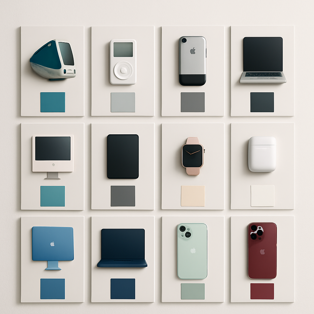
Design lovers and Apple fans now have access to a vibrant digital archive tracing nearly three decades of Apple product colors. A project called “Apple in Colour,” launched by creators at sheets.works, compiles 341 distinct shades used across Apple’s most iconic products—from the original Bondi Blue iMac to the rich Burgundy of the iPhone 18 Pro Max.
What is “Apple in Colour”?
“Apple in Colour” is an interactive catalog that brings together every officially named or numbered Apple color ever used in consumer products. It spans multiple device lines—iMacs, iPhones, iPads, iPods, HomePods, and more—and includes standout special editions like the (PRODUCT)RED Mac Pro released in 2013.
Each entry in the archive is paired with the product’s release year and the precise name of its color, when available. When official names weren’t provided, the project retains the color number used by Apple. One of the archive’s aims is to celebrate the visual delight Apple has offered over time, not just the hardware.
Why this matters
This isn’t just nostalgia—it’s a visual story of how Apple has evolved aesthetically. Color choices reflect design trends, material technologies, and even shifts in public taste. From the bold, translucent plastics of the early 2000s to the more sophisticated finishes of today, this archive lets us track those changes in a striking, visual way.
“Apple in Colour” joins other retrospectives, such as those that document every iPhone or iPad release, or those celebrating the spectrum of iPod colors. Projects like these show that hardware is more than specs—it’s style, mood, identity.
Whether you remember warming up by the glow of a blue iMac, collecting multiple iPod shades, or debating which iPhone color looks best, this catalog is a chance to reconnect with that history.
Analytically, this archive underlines Apple’s consistent use of color as part of its identity and marketing strategy. It reminds us that the hues Apple chooses do more than differentiate product SKUs—they signal innovation, exclusivity, and play a role in the brand’s emotional appeal. Going forward, designers and historians will have a richer reference to analyze how color translates into consumer perception. The colors seem small, but they shade the story of Apple.