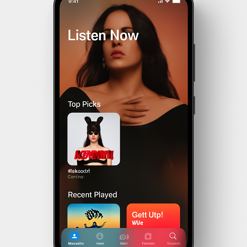
Apple Music’s Android app is getting a bold visual overhaul with its newly introduced 7.0 beta, bringing the Liquid Glass design language—first seen on Apple platforms—to Android users. The redesign introduces a more translucent and fluid interface, with a floating bottom bar that hints at what lies above, beneath, and to the sides. Meanwhile, the mini-player has broken free from its fixed position, adopting the same see-through aesthetic. Unlike iOS, the navigation bar here doesn’t shrink when you scroll—elements remain fixed in place.
Across the app, top bars have been refined: page titles and overflow menus now sit on the same line, and the three-dot icons have shed their red hue and been moved into circular containers. In the Library tab, options like “Edit Pins” and “Edit Categories” have been tucked into the overflow menu rather than standing alone. Artist pages receive a major update too: their backgrounds now match the cover art, with a more prominent play button, an info section moved higher, and the share button relocated to the top right.
Edge-to-Edge & Other Changes
The settings screen has seen a cleanup, with improved grouping of options and a fresh look. The “Now Playing” page remains mostly untouched, matching its iOS counterpart—no sweeping changes here. One of the more noticeable transformations is at the app’s borders: status and navigation bars now stretch edge-to-edge, embracing modern full-screen design conventions.
This launch marks a shift in versioning too—Apple Music for Android is now aligned with Apple’s iOS numbering system. Version 7.0 on Android echoes iOS 27. Currently in beta, the app is available through the Google Play Store’s testing program. Early testers say it’s stable, and these preview builds usually last for a few weeks before release.
This redesign comes a year after Liquid Glass made its debut on Apple platforms, now rolling into Android to offer visual consistency across ecosystems. While the interface update is mostly cosmetic, the design decisions reflect growing emphasis on fluid, immersive UI across all of Apple’s services—even when running on competitors’ platforms.
What this means: Android users can expect a more polished look and feel from Apple Music, one that mirrors the elegance Apple aims for on iOS. The shift toward version parity (7.0 = iOS 27) suggests a tighter alignment of feature sets and visual identity across devices. Observers should watch whether any UX trade-offs arise—performance, battery impact, or navigational quirks could test the limits of this new translucent style. Ultimately, the 7.0 beta may simply be a signpost: Apple is doubling down on design consistency, even beyond its own hardware.