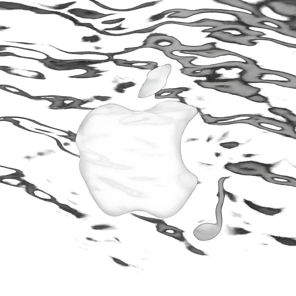
Apple Music has officially rolled out a striking new visual identity, replacing its longtime red branding with a monochromatic black-and-white aesthetic and adopting fluid, liquid-inspired design elements that reflect the movement of sound itself.
From Sound to Visuals: The Inspiration Behind the Redesign
The updated brand style was unveiled alongside a video revealing that Apple created visuals by passing sound through water. The rippling effect in the water, matched to audio frequencies, formed the basis for the new look, with brand elements placed behind the vibrating water to produce dramatic, fluid imagery.
This liquid motif aligns closely with Apple’s broader UI direction, including the Liquid Glass design introduced in earlier system updates like iOS 26 and macOS Tahoe. The new Apple Music logo and app icon further reinforce this shift, a bold departure from the familiar red color in favor of black in light mode and white in dark mode on its switchover.
When You’ll See the New Branding
The full rebrand will arrive in Apple’s upcoming software updates, starting with iOS 27.2 and macOS 27.2. These versions are expected to land as soon as next week. Users of Apple Music can expect the new logo, app icon, and visual style to become standard across platforms once these updates are installed.
Collaborators on this project include record producer Fred Again and NEST Acoustics. Their work helped refine the audio-to-visual transformation and bring the liquid design to life across Apple Music’s new identity.
Why this matters: Apple Music is resetting more than just a logo. The service is aligning its branding with modern, minimalist trends, bringing consistency with system UI aesthetics, and tapping into sensory design by translating sound into motion. For users, the rebrand will affect the app icon, brand assets, and overall experience. For Apple, it’s another step toward unifying its visual language across platforms.