Google Play Books, a cornerstone in Google’s suite of applications, has recently undergone a significant visual transformation by integrating Dynamic Color theming. This update aligns the app with Google’s Material You design principles, offering users a more personalized and cohesive interface.
Background on Material You Integration
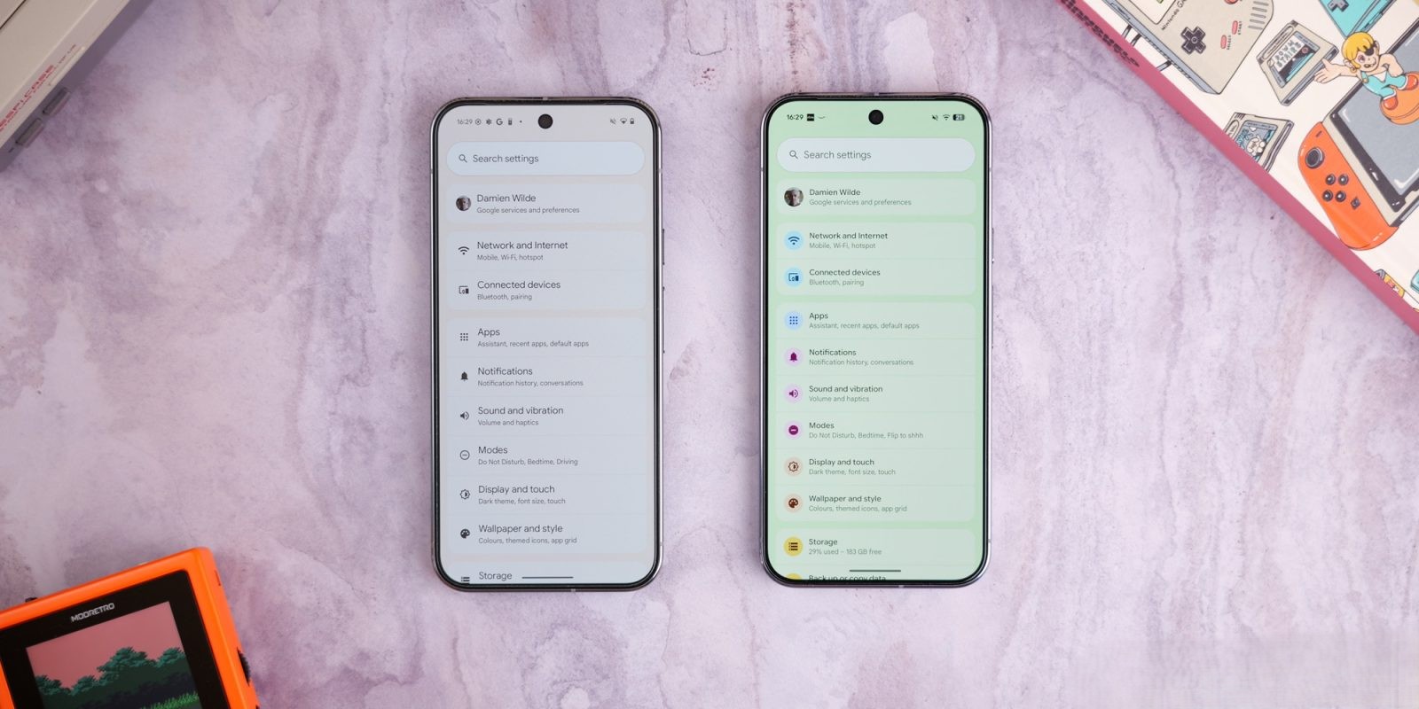
In February 2024, Google Play Books received a Material You redesign, modernizing its interface with elements like a pill-shaped search bar and updated navigation rails. However, the app retained its default blue accent color, lacking the full spectrum of customization that Dynamic Color offers. This initial redesign was a step forward but left room for further personalization.
Introduction of Dynamic Color Theming
With the latest update, Google Play Books now embraces Dynamic Color, allowing the app’s color scheme to adapt based on the user’s chosen wallpaper and system settings. This enhancement brings several notable changes:
– Bottom Navigation Bar: The background and current tab indicator now reflect the dynamic color palette, providing a seamless visual experience.
– Search Field and Top Bars: These elements have been updated to align with the dynamic color scheme, ensuring consistency throughout the app.
– Reading Interface: While the primary reading backgrounds (white, sepia, or black) remain unchanged, the display options and scrolling backgrounds have been refreshed to incorporate dynamic colors, enhancing the overall reading experience.
User Experience Enhancements
The integration of Dynamic Color in Google Play Books offers several benefits:
– Personalization: Users can enjoy a reading environment that reflects their personal aesthetic preferences, creating a more engaging experience.
– Visual Consistency: The cohesive color scheme across different app elements reduces visual clutter and enhances usability.
– Modern Aesthetic: Aligning with Material You principles, the app now offers a contemporary look that resonates with current design trends.
Implementation Details
The Dynamic Color update is part of version 2025.3.7.2 of Google Play Books. Users can access this feature by updating the app through the Google Play Store. The rollout is expected to reach all users progressively, ensuring a smooth transition to the new design.
Comparative Analysis with Other Google Apps
While Google Play Books has embraced Dynamic Color, several other Google applications are yet to implement this feature:
– Google Search: The main search results page remains without dynamic theming, though elements like the Discover feed have seen some updates.
– Play Store: The app continues to use its traditional color scheme without dynamic adaptation.
– Google Maps: Recently introduced a teal palette but has not fully integrated Dynamic Color.
– Google TV: As a former member of the Play family, it has yet to adopt dynamic theming.
This positions Google Play Books ahead in adopting a more personalized user interface among Google’s suite of applications.
User Feedback and Reception
Early user feedback indicates a positive reception to the Dynamic Color integration. Users appreciate the enhanced personalization and the modernized interface, noting that the update makes the reading experience more immersive and visually appealing.
Future Prospects
The adoption of Dynamic Color in Google Play Books signifies Google’s commitment to providing personalized user experiences. It sets a precedent for other applications to follow, potentially leading to a more cohesive and user-centric design language across all Google services.
Conclusion
The integration of Dynamic Color in Google Play Books marks a significant advancement in the app’s design, aligning it with contemporary aesthetics and user preferences. This update not only enhances visual appeal but also underscores Google’s dedication to evolving its applications in line with user expectations and modern design standards.