Spotify’s Disco Ball Icon: A Temporary Celebration for 20th Anniversary
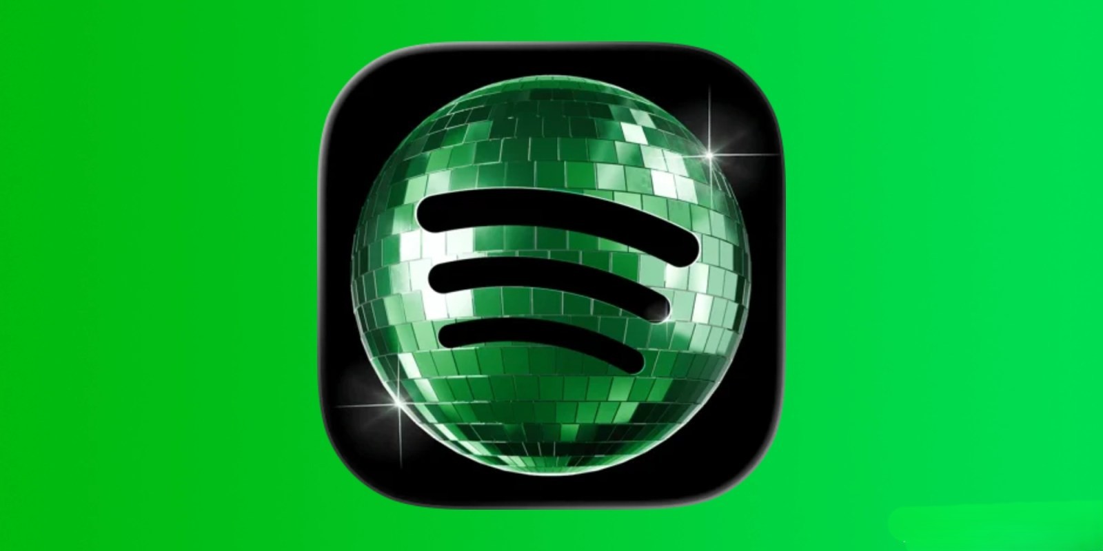
In a recent update, Spotify replaced its traditional green app icon with a photorealistic disco ball, sparking curiosity and mixed reactions among users. This design change was part of Spotify’s 20th-anniversary celebration, aiming to add a festive touch to the user experience.
The disco ball icon was intended as a whimsical, temporary alteration to commemorate two decades since Spotify’s inception. However, not all users were aware of the celebratory context, leading to confusion and some dissatisfaction. Recognizing the varied responses, Spotify addressed the concerns directly through social media.
On May 17, 2026, Spotify’s official Twitter account reassured users:
> Alright, we know glitter is not for everyone. Our temp glow up ends soon. Your regularly scheduled Spotify icon returns next week.
This announcement clarified that the disco ball icon was a short-term feature, with plans to revert to the original logo in the following week.
The introduction of the disco ball icon highlights the delicate balance companies must maintain when modifying familiar brand elements. While some users appreciated the celebratory flair, others found the change disruptive to their home screen aesthetics. This scenario underscores the importance of clear communication when implementing temporary design changes.
Historically, other companies have undertaken similar initiatives. For instance, in 2020, Instagram offered a variety of app icon options to celebrate its anniversary, allowing users to personalize their app experience temporarily. Such campaigns can enhance user engagement but also risk alienating users who prefer consistency.
As Spotify prepares to restore its original app icon, this episode serves as a case study in user experience and brand management. It illustrates the challenges of balancing innovation with user expectations and the necessity of transparent communication during such transitions.