Apple’s latest desktop update, macOS 27 Golden Gate, introduces much more than just the revamped Siri AI. Alongside the new assistant, the upgrade brings sweeping design changes, expanded HDR support, smarter iPhone mirroring, and several UI refinements that address user complaints from the last release.
App icons, design polish, and cleaner UI
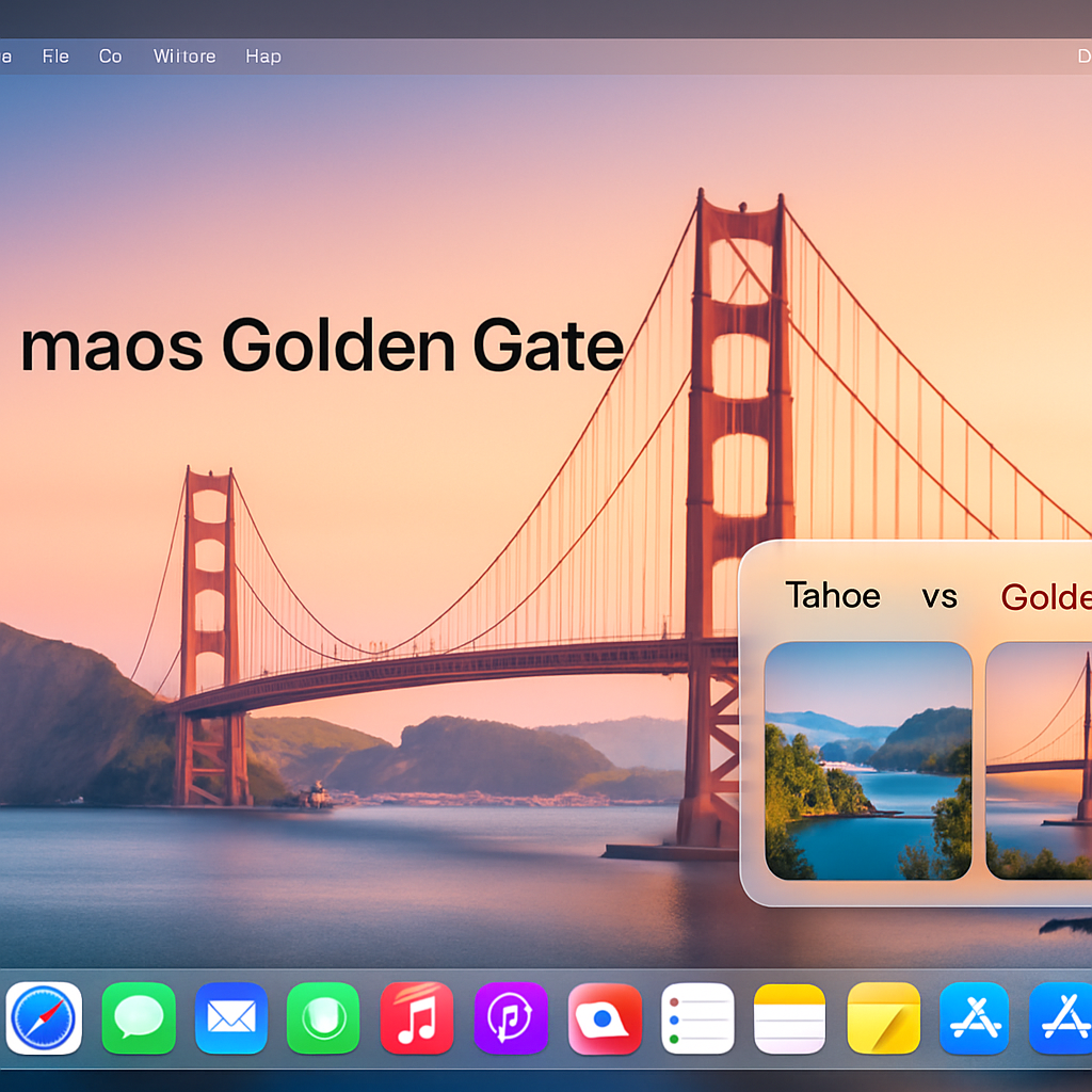
One of the most visible changes in Golden Gate is the redesign of almost all built-in app icons. Classics like Siri, Preview, and Chess receive full overhauls, while Finder, Photos, Reminders, and others are subtly adjusted. Many now reflect the Liquid Glass design language, emphasizing transparency, shading, and refined edges.
macOS 27 also tackles rough edges from Tahoe. Window corner radii have been harmonized, floating sidebars are back to edge-to-edge, toolbars now have clearer separations, and Golden Gate adds a slider so users can control how much transparency versus tint the OS applies. In response to user feedback, menus have been decluttered—reintroducing minimal use of glyphs rather than overloading every menu item with an icon.
HDR gets a system-wide boost, iPhone mirroring gets smarter
Perhaps the most significant visual upgrade is the system-wide expansion of HDR support. With Golden Gate, icons, toolbars, and other elements using Liquid Glass visuals can show richer highlights and deeper shadows—especially noticeable on HDR or EDR panels. Users must enable these effects via Settings → Displays on compatible monitors to unlock the full dynamic range experience.
iPhone Mirroring becomes far more useful in this release. Beyond retaining visual fidelity, Golden Gate adds three key improvements: access to the Control Center from within the mirrored iPhone interface; adjustable resizing (including matching the iPad mini’s aspect ratio); and lifting restrictions on playing DRM-protected content, which previously went dark when mirroring.
Although much of the conversation around macOS 27 has centered on the new Siri AI features, this update delivers on deep system design and usability refinements. From visuals (icons and HDR) to interaction (mirror improvements) to interface tidiness, Golden Gate smooths many rough edges from Tahoe.
What this means—and where to watch from here: Apple seems intent on rebalancing bold new features with polishing everyday experience. If Golden Gate is well received, it could reset expectations for how large macOS updates treat design consistency and usability. Watch for feedback from real-world users, especially those with HDR displays and who often mirror from iPhones, to see whether these changes land as promised—and how they shape what comes after.