Apple’s recent changes to iPad multitasking in iPadOS 26 introduced a windowed workflow meant to expand flexibility, but many users preferred the older Split View and Slide Over tools for simplicity. While those features made a return in iPadOS 26, they’re still buried beneath layers of windowing — and in iPadOS 27, nothing has noticeably eased that pain. The current setup forces casual users to wrestle with full-screen apps or venture into advanced windowing even for basic tasks. That’s where improvements are overdue.
What’s changed, and what hasn’t
Before iPadOS 26, multitasking was relatively straightforward: users could easily drag apps into Split View or Slide Over to work with two or more apps at once. With iPadOS 26, Apple brought in a complete windowing system. The old modes were reinstated only after user pushback, but they function only within the windowing mode — meaning users must toggle this more complex environment just to access simpler multitasking options. In practice, dragging windows slightly wrong can trigger Split View unintentionally. Even the long-press menu on the red, yellow, green buttons (“traffic lights”) for choosing multitasking states feels clunky for lightweight tasks.
The “Classic” vs. “Pro” vision
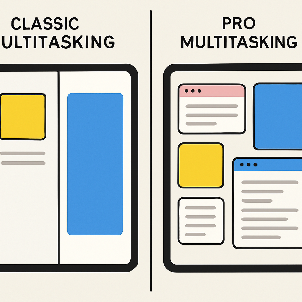
Imagine having two built-in multitasking tracks: one for users who want “Classic” multitasking and another for power users craving what were introduced in iPadOS 26. In Classic, apps would default to full-screen mode with optional Split View and Slide Over for day-to-day work. In Pro, full control over windowed apps (including toggling Stage Manager) would enable more advanced workflows, especially on larger iPads or iPads attached to keyboards and external displays.
The lack of flexibility in the current system becomes especially obvious during light tasks: casually switching between two apps, typing something while referencing another, following along in classes, or sketching ideas. There’s a steep learning curve when what used to feel instinctive now requires navigating hidden menus or shaping windows just right.
For creative workers, students, or anyone who tends to juggle multiple apps on smaller tablets, these friction points compound. The dream: combine the ease of the older multitasking setup with the power of windowing, so iPads can better suit both casual users and pros alike.
Here’s what pushing for improvements could do: a dual-mode multitasking option would let users switch between Classic and Pro. It makes full-screen default mode an option—not a requirement. Users could open apps in simplified Split View or Slide Over without needing to switch to window-mode first. And Stage Manager toggling would be easier to find and use, without accidentally triggering features there when not intended.
The current multitasking design works reasonably well on large iPad Pro models with keyboards, where precision and screen real estate make it manageable. On smaller devices or for lighter tasks, it’s overkill. Many would welcome a light mode that respects how a lot of people use iPads in everyday scenarios — reading, note-taking, messaging — without wrestling with layout mechanics intended for pro workflows.
Apple’s path forward is clear: multitasking in iPadOS 27 needs refinements that prioritize usability across the board. Whether default layout choices, simplified gestures, or easier access to classic tools — these shifts would help bring balance back to iPad usage.