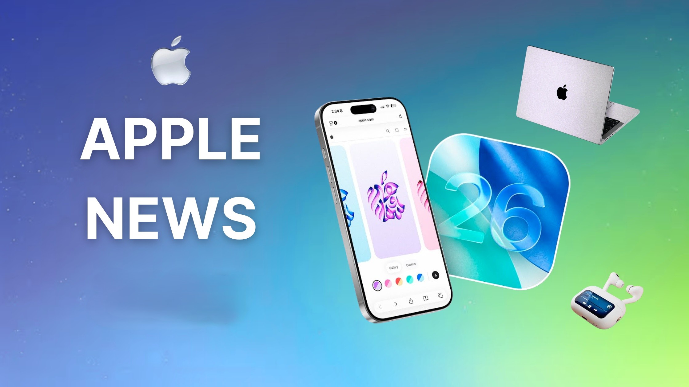
Apple’s latest operating system, iOS 27, introduces a significant overhaul to app icons, addressing previous concerns about clarity and visual appeal. This update builds upon the Liquid Glass design language introduced in iOS 26, refining the aesthetic to offer sharper and more defined icons.
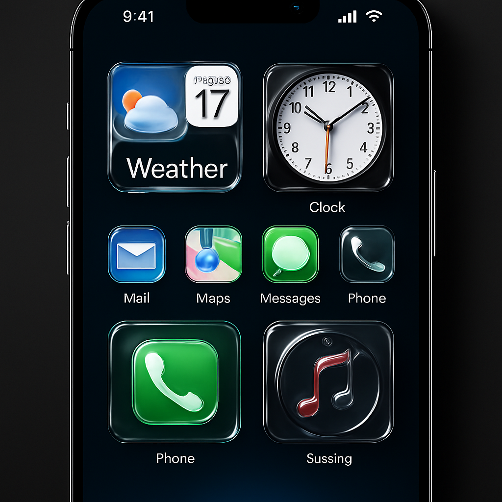
In iOS 26, Apple debuted the Liquid Glass design, aiming to provide a layered, glass-like appearance to app icons. While innovative, this approach received criticism for resulting in icons that appeared blurry and lacked detail. Users also reported an optical illusion where icons seemed tilted due to asymmetric highlights, leading to discomfort and usability issues.
Responding to this feedback, iOS 27 integrates multiple distinct layers of Liquid Glass directly into each icon’s artwork. This method enhances visual separation between layers, resulting in sharper edges and more defined refractions. The updated rendering pipeline ensures that artwork is more visible and detailed, with higher contrast and greater definition. The glass effect now serves as a refined finish rather than a dominant overlay, allowing the icon’s design to stand out more prominently.
Additionally, the motion-based shimmer effect introduced in iOS 26 has been significantly reworked. The gyroscopic specular highlight effect, which caused icons to shift with device movement and created a tilting illusion, has been removed in the first iOS 27 developer beta. Icons now feature subtle highlights around their edges, positioned at the top and bottom, which no longer shift with device movement, thereby eliminating the previous optical illusion.
To support these design changes, Apple has updated Icon Composer, its dedicated app icon design tool. The tool now allows developers to build icons from multiple layers of Liquid Glass, add selective refraction effects, and fine-tune content effects. An interactive preview feature enables developers to see how their designed icons will render, ensuring consistency and quality across the system.
These enhancements are part of a broader set of Liquid Glass refinements announced at WWDC 2026. Apple has also introduced a new system-wide transparency slider, allowing users to customize the opacity of Liquid Glass elements to their preference. This addition provides greater control over the interface’s appearance, catering to individual user needs and improving overall accessibility.
By refining the Liquid Glass design and addressing user feedback, Apple demonstrates its commitment to enhancing user experience and visual clarity in iOS 27. These updates not only improve the aesthetic appeal of app icons but also contribute to a more intuitive and comfortable interface for users.