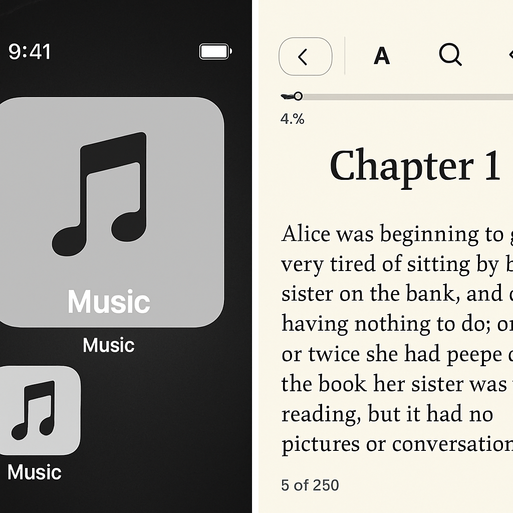
Apple is rolling out iOS 27.2 next week with major visual updates for two of its flagship apps: Music and Books. These changes, part of a broader push toward more cohesive design across iOS, modernize the look and feel of both apps in ways users will notice right away.
Music Gets a Sleek, Monochrome Overhaul
The Music app loses its signature red theme in favor of a more restrained black-and-white palette. The new app icon abandons red entirely. Within the app, tab accents shift from red to blue for active selections, while sections like Library, Artists, Albums, and Playlists become fully monochrome. Even widgets reflect the change: home screen and Today View widgets now use black backgrounds instead of the previous red. These updates mark a clear departure from the bright color accent that has long been part of Music’s identity.
Books Refines Reading Interface in Founder-Friendly Way
Books in iOS 27.2 also sees several layout shifts aimed at streamlining the reading experience. A progress bar now lets readers see exactly how far they are through a book. The menu in the lower-right of the reader view adopts Apple’s standard Liquid Glass style, aligning it with other apps. Meanwhile, unnecessary clutter is removed: the bookmark button moves from the menu to the top-right corner, while the “X” button is relocated to the top-left. Similarly, the “Back” button is now larger and placed in the lower-left, enhancing accessibility and visual consistency.
Some of these interface decisions seem especially tied to accommodating the newer iPhone models. With dynamic UI elements that adjust to different screen shapes, Apple appears focused on designs that scale—without custom components falling out of place.
These changes join a slew of other improvements coming in iOS 27.2—though these two apps may undergo some of the most visible design tweaks. Users will soon be able to get their hands on these updates when the release officially drops.
Why it matters: design isn’t just aesthetics—it affects usability. With Music’s bold move away from color and Books’ refined reader interface, Apple is signaling that consistency, legibility, and adaptability across devices are priorities. What to watch: how users react to the loss of Music’s red identity and whether Books’ new layout improves reading comfort—or introduces new friction. These shifts set the stage for more unification in Apple’s UI going forward.


