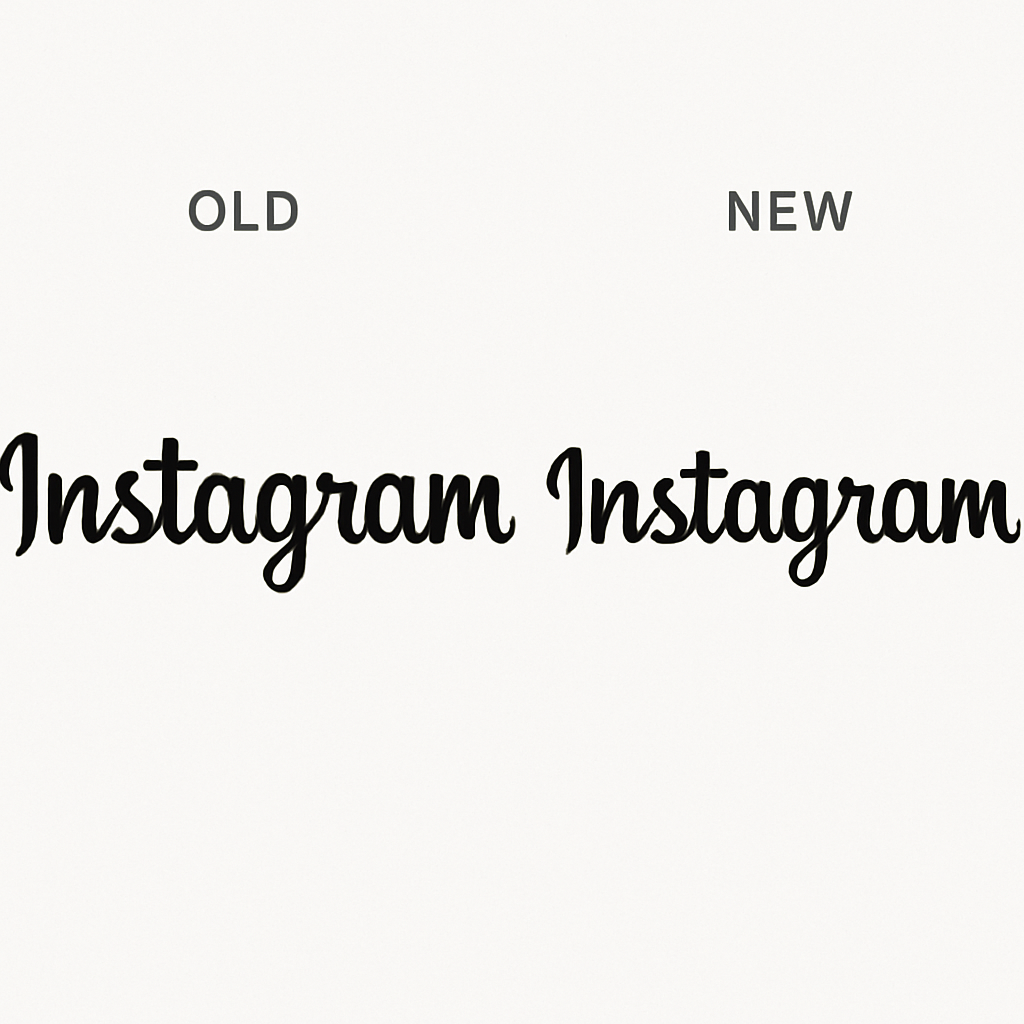
Instagram has introduced a refreshed wordmark, marking the first significant update to its text-based logo in a decade. The new design aims to present a sharper and more contemporary appearance while maintaining elements of the original logo’s simplicity.
Adam Mosseri, head of Instagram, announced the change on both Instagram and Threads, describing the updated wordmark as “sharper and more modern” yet still referencing the original design. This redesign reflects Instagram’s ongoing efforts to stay current in the rapidly evolving social media landscape.
Reactions to the new wordmark have been mixed. Some users appreciate the fresher look and the choice of font, while others have humorously noted that the stylized “r” resembles a “z,” leading to playful interpretations like “Instagzam.” Despite these varied opinions, the brand’s strong recognition ensures that the name remains identifiable.
The updated font incorporates cursive-like elements, adding vintage curves to letters such as “s,” “r,” and “g.” This design choice is intriguing, especially considering that cursive writing is less commonly taught to younger generations, potentially making these stylistic features less familiar to some users.
Instagram’s last major design overhaul occurred in 2016, when the company transitioned from its classic brown camera icon with a rainbow stripe to the vibrant pink gradient icon that remains in use today. This latest wordmark update continues Instagram’s tradition of evolving its visual identity to align with contemporary design trends.
While Meta, Instagram’s parent company, has not provided additional comments on the redesign or indicated whether further design changes are forthcoming, this update underscores the importance of visual branding in maintaining user engagement and staying relevant in the competitive social media market.