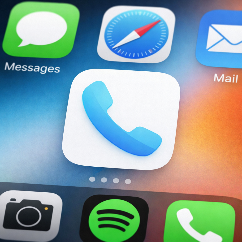
Google has introduced a fresh look for its Phone by Google app in version 246, now available on the beta channel. This redesign centers on the app icon, which adopts a gradient styling on both the earpiece and mouthpiece of the handset graphic. The goal is a flatter, lighter appearance that aligns more closely with the current Google ecosystem aesthetic.
What’s Different in the New Icon
The updated icon features a slightly larger handset, though the overall silhouette and basic form are maintained to ensure familiarity. One notable change: the darker blue shade used in the old design has been dropped. In its place are lighter tones and gradient effects that make the icon appear crisper and clearer, especially when viewed among other Google apps on the homescreen.
Availability and Other Changes
As of November 5, the new icon is limited to the Phone by Google beta channel. The Contacts tab restoration is still pending for stable release users. Over the next few weeks, the 246 version is expected to roll out more broadly to stable users. Those interested in accessing the update early can join the beta via the Google Play Store listing.
This update follows recent design adjustments in other Google apps, continuing the company’s push toward a cleaner, more cohesive visual identity across its suite. While icon changes may seem cosmetic, they factor into perception and usability—especially as users interact with multiple Google tools daily.
What this means: The design refinements in Phone by Google 246 may seem small, but they reflect a broader shift toward consistency and minimalism in Android’s user interface. As the update expands from beta to stable, users will get to see whether these adjustments land as intended—improving visual harmony without sacrificing recognition or clarity.