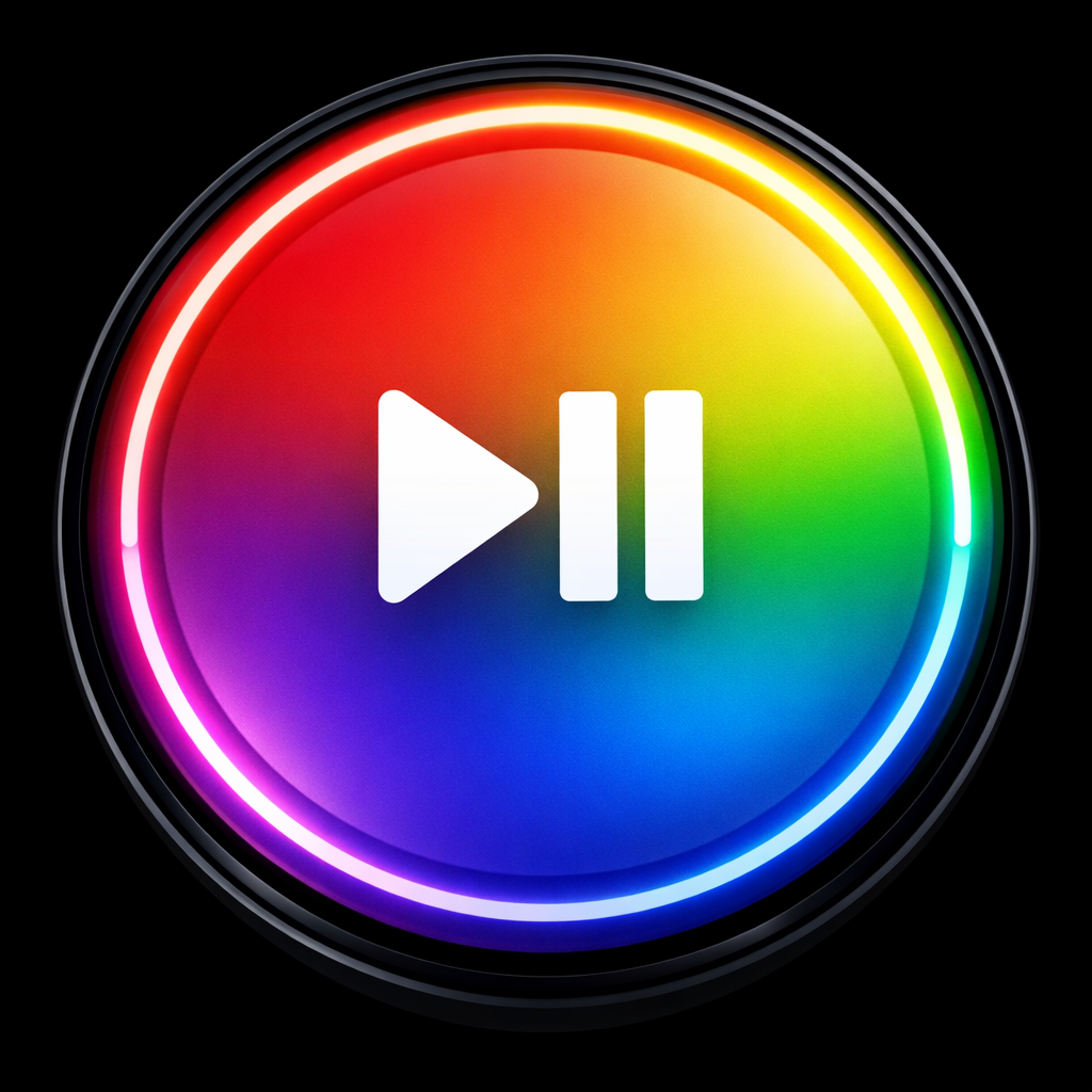
Google has rolled out a fresh redesign for the Media Controls app icon on the Pixel Watch, embracing its signature gradient theme in a bold new way. The update sees the Media Controls icon now featuring a full-gradient backdrop, a central play/pause symbol, and a circular playback ring bordering the icon—matching aesthetics now seen across several Pixel Watch apps. The app’s core functionality remains unchanged.
Gradients, Icons, and Design Evolution
This change signals more than just a color tweak. The updated look ditches traditional borders in favor of letting the gradient cover to the edges, while the surrounding ring visually cues playback progress. It aligns with Google’s broader push in recent months to refresh its Wear OS icons, making them more vibrant and integrated.
Where This Fits in Google’s Timeline
The Media Controls icon redesign joins earlier recent updates to other Pixel Watch app icons, including Alarm, Stopwatch, and Timer, which also got gradient-driven overhauls around August and September. These moves suggest Google is gradually updating the look of its wearable ecosystem, balancing consistency with usability.
With many Pixel Watch users finding value in visual cues—especially in glanceable contexts—the playback ring around Media Controls is particularly notable. It’s a subtle but meaningful shift in how information is displayed at a glance, prioritizing usability alongside style.
Why this matters: icons are often the first thing wearable users interact with. Small updates like this can shift how users perceive the device’s polish, consistency, and intuitiveness. What to watch for next will be if Google extends this redesign to more apps, or if it uses dynamic elements (like playback rings) more broadly—for example, in music, fitness, or notification indicators. Consistency across the UI may soon become a stronger priority in Wear OS’s visual identity.