Google has initiated a significant redesign of its Google One app for Android, aligning it with the Material 3 Expressive (M3E) design language. This update introduces a more streamlined and user-centric interface, enhancing both aesthetics and functionality.
Key Changes in the Redesign:
1. Removal of Illustrations: The app has eliminated the friendly illustrations that previously adorned the top of each tab. This change results in a cleaner interface, allowing users to focus more on essential content.
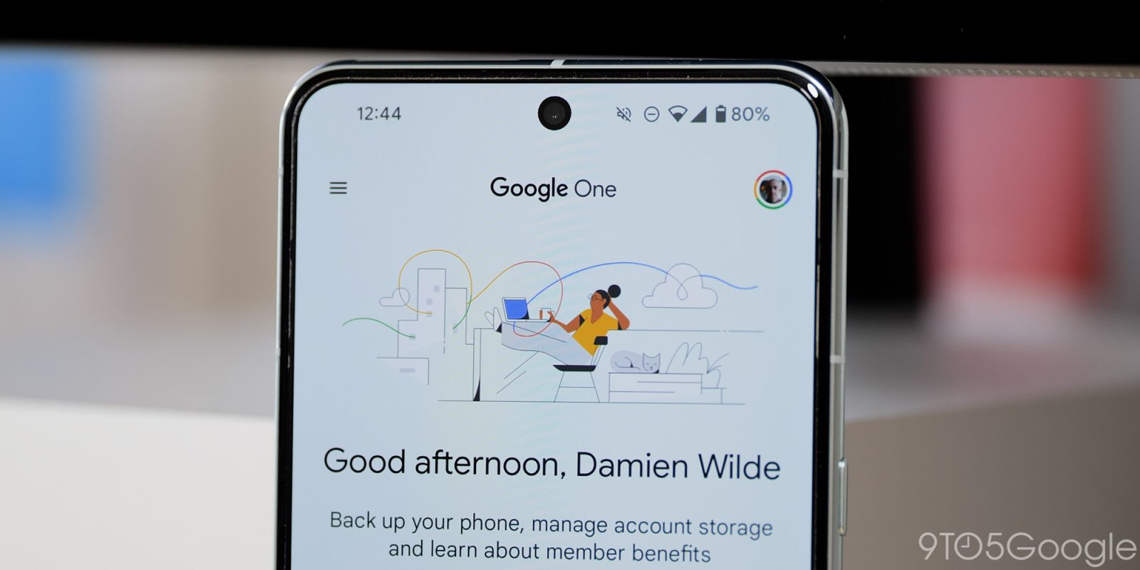
2. Enhanced Home Feed: Users are now greeted with a time-of-day message, and critical sections such as Storage, Backup, and Clean Up are prominently positioned higher on the screen for easier access.
3. Card Design Updates: Throughout the app, cards now feature more rounded corners and subtle outlines, contributing to a modern and cohesive visual experience.
4. Storage Tab Refinements: The per-app storage breakdown is now encapsulated within a card alongside the Clean up space button, simplifying the process of managing device storage.
5. Device Backup Adjustments: While the Device Backup section has undergone minor tweaks, its core functionality remains consistent, ensuring users can continue to back up their data seamlessly.
6. Benefits Section Modifications: Similar design tweaks have been applied to the Benefits section, enhancing visual consistency across the app.
7. Bottom Navigation Bar Redesign: The bottom bar has been shortened, moving away from the previously taller style, which aligns with the M3E’s emphasis on minimalism and usability.
8. Settings List Overhaul: The Settings list now boasts a large header, with each item placed within a card and grouped thematically. This reorganization aims to improve navigation and user comprehension.
Dynamic Color Integration:
An initial bug led to the absence of Dynamic Color in the redesign, resulting in a shift from dark blue to gray tones. This issue has been addressed in version 1.272.x of Google One, reinstating the Dynamic Color feature and ensuring a vibrant and personalized user interface.
Rollout Status:
The M3E redesign is being deployed through a server-side update to version 1.271.x of the Google One app for Android. As of now, the update is not universally available across all devices, indicating a phased rollout approach.
Understanding Material 3 Expressive:
Material 3 Expressive is Google’s latest design language, building upon the foundation of Material You. It emphasizes personalization, fluidity, and a more engaging user experience. Key features include:
– Natural Animations: Introduction of spring-based motion systems that make interactions feel more dynamic and intuitive.
– Dynamic Color Themes: Enhanced color theming that adapts to user preferences and wallpapers, providing a personalized aesthetic.
– Typography Refresh: Updated type styles designed to improve readability and user attention, with larger sizes and improved hierarchy.
– New Shapes and Components: A diverse shape library and updated UI components that allow for more varied and engaging interfaces.
The integration of M3E into the Google One app signifies Google’s commitment to providing a cohesive and user-friendly experience across its suite of applications. Users can anticipate similar updates in other Google apps as the company continues to roll out the Material 3 Expressive design language.