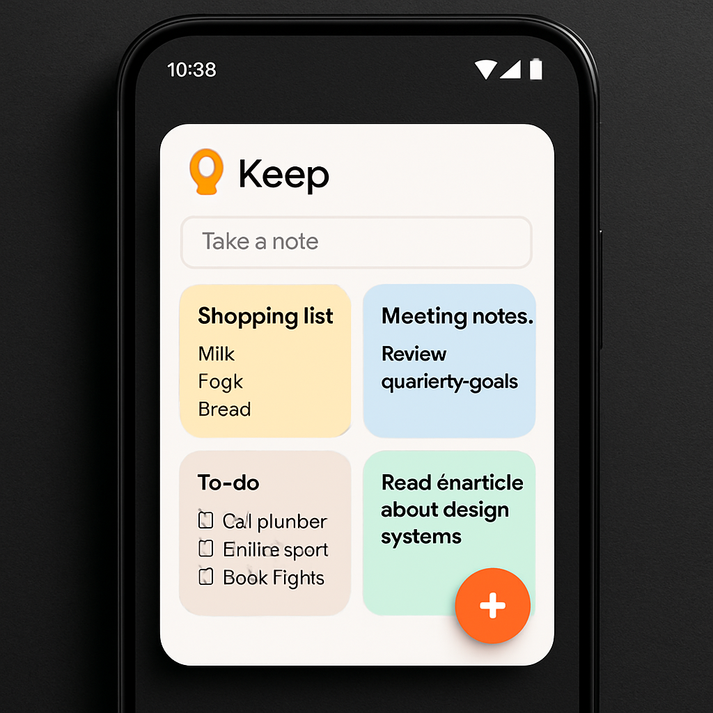
Google is rolling out a subtle but meaningful tweak to the homescreen “Note collection” widget in its Keep app for Android. The newest version (5.26.365.x) replaces the old sidebar with note-type shortcuts—such as text, list, drawing, audio, or photo—with a cleaner floating action button (FAB). This update shifts away from the Material You–style sidebar and introduces a two-tap system for starting a new note. With one tap you open the widget’s quick-capture menu; the second tap opens the specific note type.
What’s Changed
Previously, users saw a vertical sidebar of shortcuts built into the widget for various note modes. Now, Keep shows those tools tucked behind a floating action button, following the pattern already used in Keep’s “Single note” layout. This also aligns with how the smaller “Quick capture” widget operates. The change means fewer permanent icons cluttering the widget and a more streamlined note-creation flow.
Design-wise, the widget now fills more horizontal space and shows more of each note content—especially noticeable on wide homescreen layouts. Earlier versions left empty margins alongside the sidebar, making note previews feel cramped. By doing away with that sidebar, Keep now provides a fuller, more edge-to-edge layout.
Rollout & Related Keep Features
The refreshed homescreen widget is currently rolling out via the Google Play Store in version 5.26.365.x.
This update follows the recent launch of Keep Live, a feature available to Google AI Plus, Pro, and Ultra subscribers. Keep Live expands Keep’s functionality with live updates and real-time syncing enhancements. It’s part of a wave of new “Live” branded features across Google’s productivity tools.
Why It Matters: Widgets are often one of the few ways Android users get instant access to app content without opening apps. Small tweaks like this can meaningfully improve usability, especially for people who rely on Note-taking tools daily. That new floating action button makes note creation more deliberate and less visually distracting, while the edge-to-edge design ensures better visibility of content. What to watch: how well users adapt to the two-step note creation flow, and whether future updates restore or introduce more shortcut options within widget constraints.