Google has completed the rollout of its redesigned gradient icons for Workspace applications across Android, iOS, and web platforms. This visual update, initiated on May 18, 2026, just before the Google I/O conference, aims to provide each app with a more distinct and recognizable identity.
Comprehensive Rollout Timeline
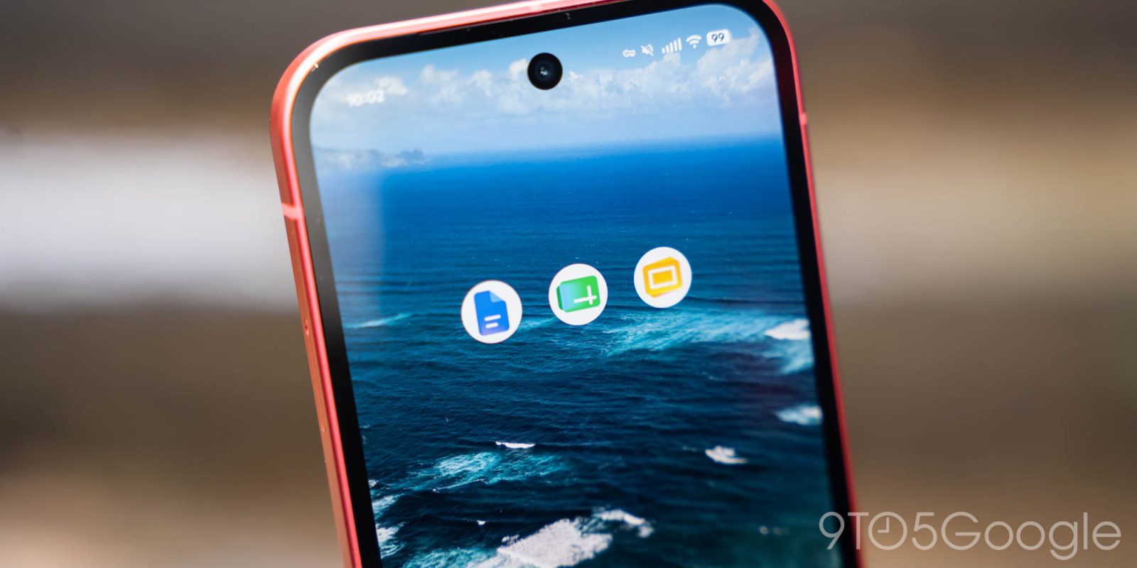
The introduction of the new icons began on the web, with iOS devices receiving the updates by May 26. The Android rollout concluded on June 4, encompassing key applications such as Gmail, Google Calendar, Tasks, Chat, Meet, Drive, Docs, Slides, Sheets, Keep, and Voice. Notably, services like Google Forms, Sites, and Vids, which lack dedicated mobile applications, were also included in the redesign.
Design Enhancements and Visual Identity
The redesigned icons feature subtle gradients and a departure from the previous uniform use of Google’s four primary colors. Except for Gmail, which retains its traditional color scheme due to its prominence, other icons now emphasize a single dominant hue. For instance, Google Drive incorporates three distinct colors, while the remaining applications focus on one main color. This approach enhances visual differentiation and aligns with Google’s Gemini Era design philosophy.
Additionally, the new icons adopt unique shapes, moving away from the earlier design where multiple logos were confined within a similar page-shaped container. This change aims to provide each application with a more distinct identity, making them easily recognizable on users’ screens.
User Reception and Accessibility
The updated icons have been met with mixed reactions from users. While some appreciate the modern aesthetic and improved differentiation between apps, others have expressed a preference for the previous designs. Despite varying opinions, the overarching goal of the redesign is to enhance user experience by making each application’s icon more identifiable and visually appealing.
For users eager to experience the new icons ahead of the official rollout, methods such as recreating the icons through design tools like Figma have been explored. These recreations can be installed on various platforms, including Windows, Mac, Android, and iOS, allowing users to personalize their app interfaces.
Conclusion
Google’s comprehensive redesign of Workspace app icons signifies a strategic effort to modernize and distinguish its suite of applications. By introducing gradient designs, unique shapes, and a focused color palette, Google aims to enhance user recognition and engagement across its platforms. As the rollout completes, users can expect a more cohesive and visually appealing experience when interacting with Google’s suite of productivity tools.