Apple Restores Clarity: macOS Golden Gate Eliminates Menu Icons
Apple’s latest operating system, macOS Golden Gate, marks a significant shift in user interface design by removing icons from menu items—a move that enhances clarity and usability.
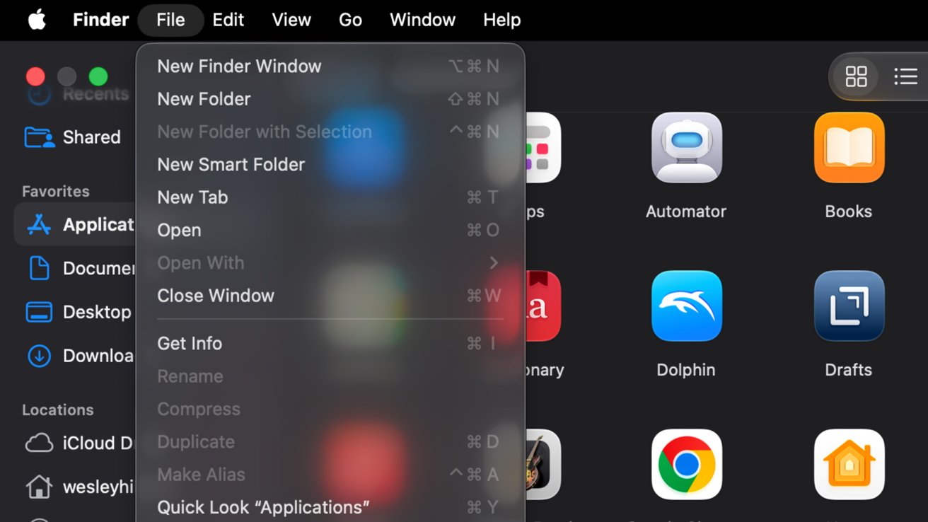
In the previous iteration, macOS Tahoe, Apple introduced the Liquid Glass design, which added icons next to every menu item. While intended to modernize the interface, this change led to visual clutter, making it challenging for users to quickly identify and select menu options. The uniform presence of icons diminished their effectiveness, as the brain tends to overlook repetitive visual elements.
Recognizing user feedback, Apple has reverted to a cleaner menu design in macOS Golden Gate. By eliminating these icons, the menus now offer a streamlined appearance, allowing users to navigate more efficiently without unnecessary distractions.
This design decision aligns with Apple’s longstanding commitment to simplicity and user-centric design. By focusing on essential elements and reducing visual noise, macOS Golden Gate enhances the overall user experience, ensuring that functionality remains at the forefront.
The removal of menu icons is part of a broader effort by Apple to address user concerns and refine the macOS interface. Other adjustments include rectifying mismatched corner radii and refining the Liquid Glass design introduced in macOS Tahoe. These changes demonstrate Apple’s responsiveness to user feedback and its dedication to continuous improvement.
As macOS Golden Gate becomes available, users can look forward to a more intuitive and visually cohesive operating system. By prioritizing clarity and usability, Apple reaffirms its commitment to delivering a seamless computing experience.