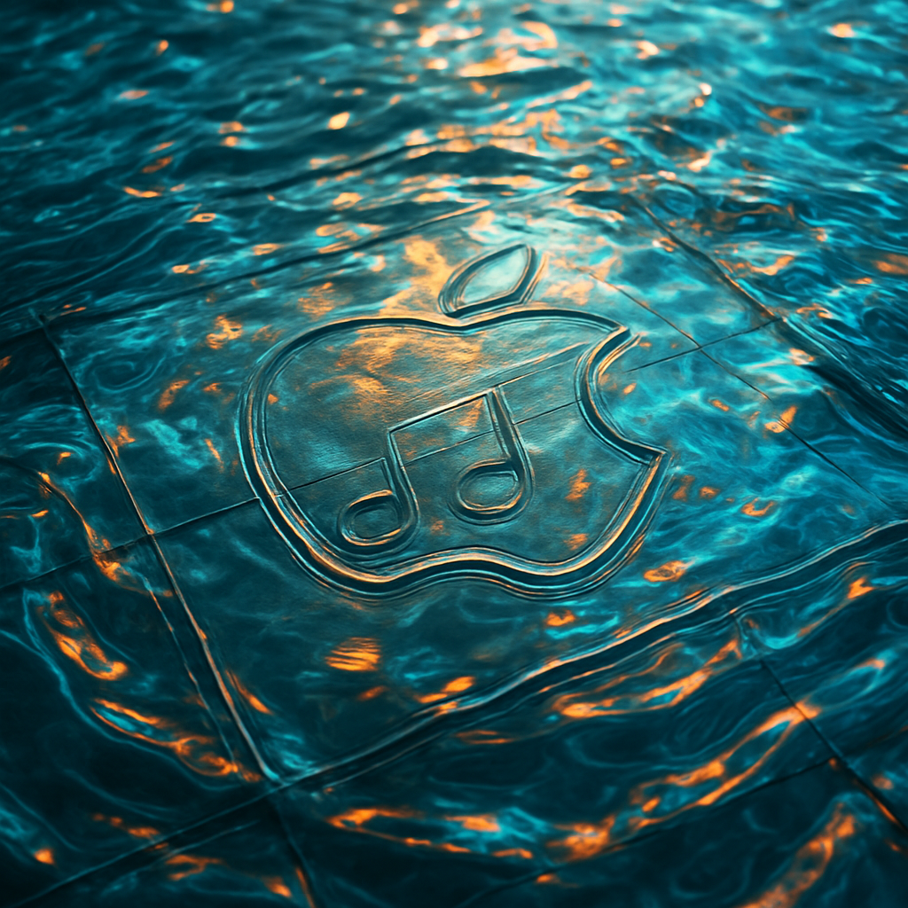
Apple has revealed a bold new visual identity for Apple Music rooted in sound itself. At the opening of its Apple Music Hall in London’s Battersea, the company introduced a rebrand built around a “made by sound” visual sting that ripples and distorts the Apple Music logo through fluid animation. The design comes from a collaboration with British producer Fred Again… and the studio NEST Acoustics, turning music into moving glass art.
From sound waves to visual art
The centerpiece of the rebrand is a practical effect: a chunkier, more tactile version of the Apple Music logo was etched into the bottom of a glass tank, which was then filled with mineral oil. A transparent cover in the shape of the app icon was placed on the top. When a specially composed series of tones plays, a transducer vibrates to send waves through the oil, warping the logo and creating a gorgeous liquid distortion. The result is a rippling visual that’s both organic and precisely crafted.
This footage, captured in-camera rather than via CGI, forms the base of the new visual sting that now introduces Apple Music video content—including concerts and other video material. There’s also a stripped-back version with just the two-note mnemonic logo, which overlays video content without any text.
Liquid Glass aesthetic and legacy
The effect echoes Apple’s ongoing “Liquid Glass” design language, first seen in its rebrand of Apple TV in November 2025, which similarly emphasized fluidity, texture, and real-glass reflections. Both redesigns embrace physical, studio-crafted visual elements over digital effects, reinforcing Apple’s push toward design that feels tangible and sensory.
Sound plays a recruiting role here—not just as source material, but as the driving force shaping the visuals. Apple Music worked with Fred Again… to compose the tones used for the final mnemonic, while NEST Acoustics designed the rig and setup to translate those sounds into motion.
This isn’t just cosmetic: the redesign marks a shift in how Apple thinks about branding and identity. By making sound central, Apple is not merely changing how its logo looks—it’s changing how its brand moves into video, performance, and music experiences.
The “liquid glass” rebrand won’t just appear in London—its rippled visual sting and two-note mnemonic are headed for broader rollout across Apple Music’s video content globally. It’s now the signature visual that kicks off content and reinforces the identity of the service.
What this signals is a deeper investment in sensory branding. As Apple leans into designs that feel crafted, physical, and responsive, the gap between audio, visual, and brand identity shrinks. The Liquid Glass rebrand isn’t just design for design’s sake—it’s a statement about how Apple wants you to see—and feel—its music.