Google’s recent rollout of Android 17 QPR1 introduces subtle but notable tweaks to the status bar icons on Pixel phones—some of which may have flown under users’ radars.
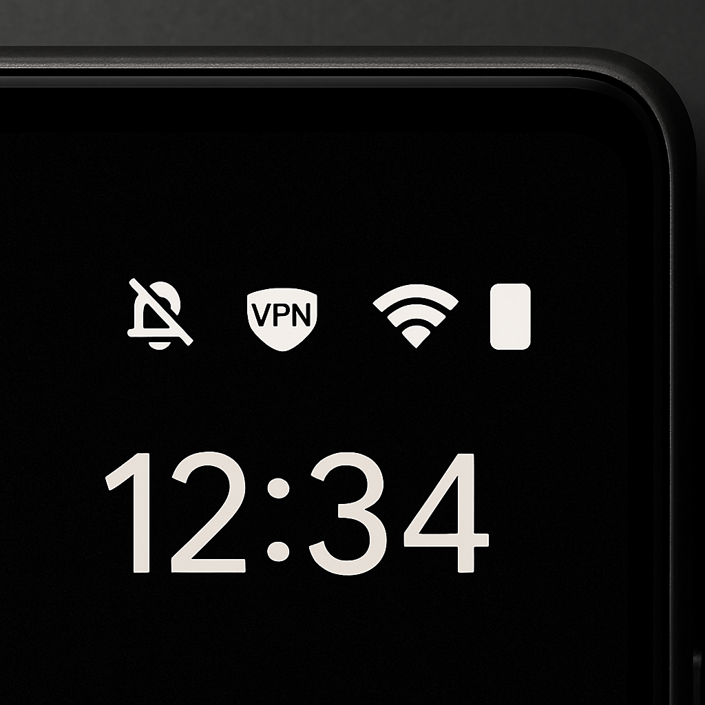
One of the most visible changes: the icon that indicates mute or silent mode. In QPR1, the crossed-out speaker icon has been swapped out for a bell. That’s a shift back toward older visual language, since Google moved from bell to speaker in Android 14. Interestingly, this icon update didn’t appear in the Android 17 QPR1 beta builds—it only showed up once the stable OTA (over-the-air) update began rolling out. (Just to be clear, as of QPR2 Beta 5, the speaker icon still shows up there, even though the bell is used in the stable version.)
Another icon that’s been altered is the VPN indicator. With QPR1, the VPN symbol has been made thicker and filled in, deviating noticeably from its previous outline-only style. Like the mute icon swap, this change wasn’t present in the beta versions—suggesting this tweak was inserted late in development and wasn’t widely tested.
Why It Might Matter
These kinds of UI adjustments may seem small, but they can have bigger implications—especially for longtime users accustomed to specific iconography. Fighting consistency issues across versions is tough, and design regressions can lead to confusion. For example, seeing a bell versus a speaker might lead someone to misinterpret whether their phone is muted.
At this point it’s unclear whether these changes are intentional design decisions or accidental regressions. If many users voice complaints, Google may revert one or both in future updates. A likely candidate for any fix is Android 17 QPR2, expected this December. Note also that these icon shifts and updates aren’t yet appearing on the Pixel 11 series, which hasn’t received Android 17 QPR1.
Even minor tweaks like status icons matter. They play a big role in the overall user experience—especially for brand loyalty among Pixel users who expect polish and consistency. We’ll be watching to see whether Google reverts those icons in response to feedback and how the company handles design stability moving forward.