Apple has tinkered with a feature dubbed the “complication column” for the Lock Screen on the upcoming iPhone Duo, according to fresh leaks. It’s one in a series of UI changes the company has made to better suit the Duo’s dual-screen layout, especially in iOS 27 and beyond.
What the complication column is
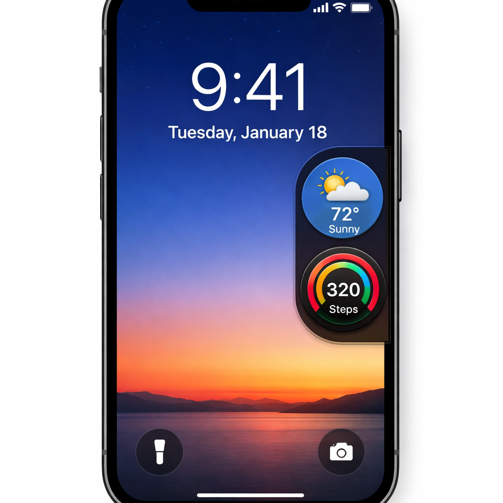
The proposed complication column would live on the right edge of the Lock Screen and hold two circular widgets. These widgets are sized similarly to those at the bottom of the screen and situated between the flashlight/camera shortcuts and the Wi-Fi/cellular status icons. On the current Duo Lock Screen, users get bottom-aligned widgets and fixed controls for shortcuts like flashlight and camera, plus signal indicators at the top. This new column aims to fill the right-side vertical space with useful content.
This feature surfaced in code from iOS 27.1. Reports show the column flagged under something called “SpringBoard/Ionic (disabled)”, and since its discovery, there haven’t been any further changes. That suggests it may have been dropped or is on pause. There’s no sign yet that the feature is shipping in current beta builds.
Why this was under consideration
The iPhone Duo has prompted Apple to rethink its Lock Screen layout because having two screens—an inner and outer display—changes how interface elements fit. Currently, the bottom area hosts widgets while controls for the flashlight and camera are positioned for easy access. The screen’s top shows cellular and Wi-Fi status. The complication column would squeeze in two more widgets, enhancing usability and reducing empty space, particularly along the right side of the Lock Screen panel.
Even though the column has yet to appear in released software, this kind of test reveals how Apple is exploring ways to optimize multi-screen form factors. The Duo’s dual displays offer opportunities—and design challenges—unlike the traditional one-screen iPhones.
The feature may not make it into final builds; code is disabled and unchanged since first seen. Apple often prototypes UI tweaks that don’t ship—or leaves them for later iOS updates.
Below are rendered mocks of how users might see two circular widgets aligned in that vertical column, reflecting developer insights from code leaks.
What to watch
Keep an eye on future betas of iOS 27 or potentially iOS 27.x—especially those aimed at Duo hardware. If the complication column returns to active development, it could appear in a coming update. Also important is whether Apple refines the widget-options for the right column: what kinds of widgets are allowed, how users pick them, and whether there are restrictions based on inner vs outer display.
For end users, these changes may seem minor—but UI tweaks like this often signal how seriously Apple is rethinking the basics to match bold new hardware. The iPhone Duo is one such push, and even buried features in code offer a glimpse into what the experience might evolve into.
What this means: The leak shows Apple investing in usability improvements for the Duo’s Lock Screen—especially for leveraging vertical space. Even disabled, the complication column concept gives fans hope for future customization. It could mark a move toward more flexible, widget-rich Lock Screens if Apple chooses to revive it. Track iOS 27 beta notes to see if this design test becomes a real feature.