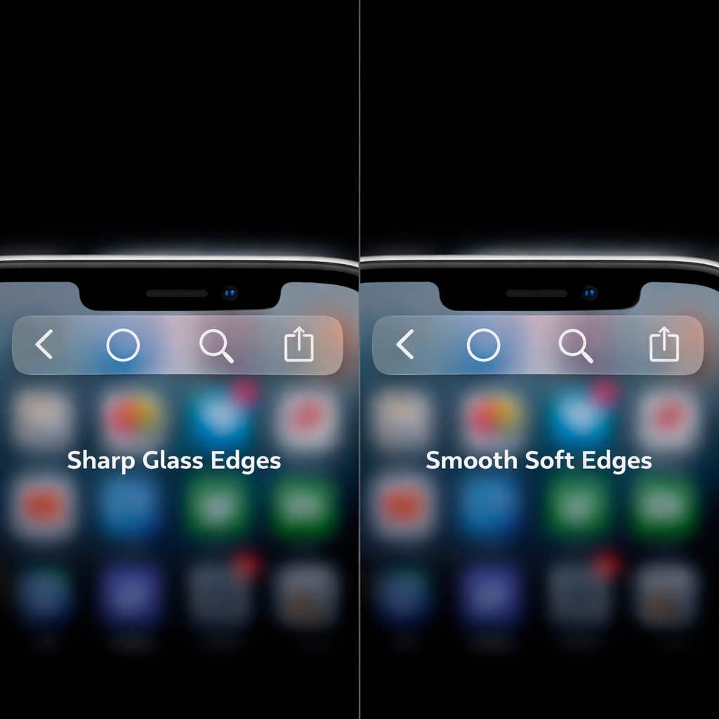
The Liquid Glass design overhaul drew polarized reactions since its debut—some applauding its modern transparency effects, others decrying it as visually jarring. In response, Apple is now trialing a modest yet meaningful tweak aimed at easing the friction: reintroducing the softer scroll-edge effect on navigation bars when the transparency (or “glass tint”) is dialed down to 25% or less.
What’s changing and how it works
The new adjustment is currently hidden behind an internal flag called UIKit/clear_glass_soft_pocket, which reverts scroll-edge styling to what it looked like in iOS 26—less abrupt, more muted transitions where content meets navigation bars. This is only triggered when the device is set to use the “default/auto” style and the glass tint level is reduced to 25% or below. For transparency levels higher than that, the existing, sharper edges introduced with Liquid Glass remain in effect.
Seen in early testing builds, this change isn’t sweeping—it doesn’t overhaul the design—but some users find even subtle softening a welcome reprieve, especially those sensitive to visual harshness or those who preferred the gentler border fades of older iOS versions.
Why this matters
Liquid Glass marked one of Apple’s bolder interface redesigns in recent years. Highly transparent navigation bars, ultracrisp glass-like backgrounds and sharp cut-off points weren’t universally loved. To its credit, Apple rolled out a transparency slider that allowed users to lessen the frosted or glossy intensity. This new change appears to extend that control, restoring a part of the older visual aesthetic to accommodate more tastes.
Feedback from beta testers and UI explorers has clearly reached Apple: the existence of the UIKit/clear_glass_soft_pocket flag signals active tweaking behind the scenes. This suggests Apple isn’t blindly pushing forward with Liquid Glass as-is but is committed to refining it. Given how even small UI frustrations—edges, overlays, transitions—can affect comfort and perceived polish, this feels like a smart move.
Whether this slip of aesthetics will end up in the final version of iOS remains to be seen. But it underscores a broader lesson in design: no flagship feature survives unaltered in the wild. As Apple responds, users should look for this change in upcoming betas—especially if they’ve been longing for softer navigation bar transitions under low transparency.