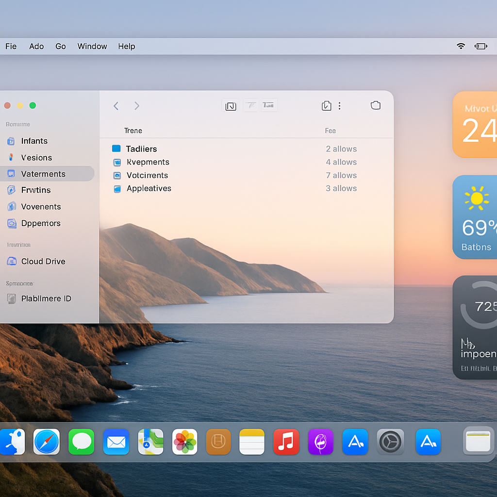
macOS 27 Golden Gate brings a refined take on Apple’s Liquid Glass design, letting users set the exact transparency level of interface elements for the first time. Rather than choosing just between “clear” and “less clear,” Golden Gate introduces a slider that offers a wide range, from nearly transparent through medium, all the way to quite opaque. The system defaults to medium and even nudges users to adjust the slider during initial setup.
What Shades Change With Liquid Glass
The slider doesn’t just affect window backgrounds—it alters multiple visual components across the system. The Dock shifts from showing vivid wallpaper through to a more solid, defined background as the slider moves. Widgets, meanwhile, transform in opacity: when dimmed, their appearance adjusts based on slider position. The Now Playing bars in Apple Music and Podcasts also adapt, as do sidebars, toolbars, and toolbar buttons in apps like Safari and Photos. Essentially, every part of the interface relying on window chrome adjusts in sync.
Controls & Preview Features
Liquid Glass in macOS 27 isn’t constrained to preset steps. While there are three main notches—”most clear,” “medium” (the default), and “most opaque”—users can place the slider anywhere along the continuum for intermediate opacity. A live preview shows how each transparency level will affect elements on the screen. You’ll find the slider during setup or anytime later in System Settings → Appearance.
This change builds on Apple’s past design developments. Liquid Glass first debuted with macOS 26 Tahoe (and iOS 26) offering a single transparency level. Later updates added a “less clear” option. With macOS 27 Golden Gate, the design language grows far more flexible.
The unified approach means one slider controls all Liquid Glass appearances system-wide: the Dock, widgets, window chrome, toolbars—all respond to the same transparency setting. No more tweaking each component separately.
This addition is less dramatic than some headline features, but it’s a strong signal that Apple is catering to user taste and visual accessibility. Whether people prefer a clean, sleek translucent effect or a more solid, focused UI, this lets them choose.
Analysis: This slider doesn’t just offer aesthetic options—it reflects Apple’s evolving design philosophy toward user control over visuals and ambient experience. Transparent UI elements are beautiful, but they can clash with certain wallpapers, lighting conditions, or visual preferences. Giving people a precise control ensures Apple isn’t forcing one style on everyone. What to watch next: whether developers can influence or override system transparency for individual apps, and how this feature ages in terms of performance and battery impact.