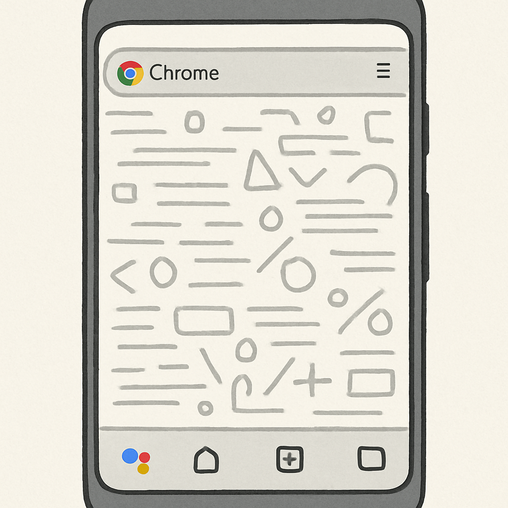
Google is gradually rolling out a redesign of Chrome on Android that adds a secondary toolbar at the bottom of the screen — but early impressions suggest this change may overload the interface. Users report that the update introduces buttons for Home (optional), Gemini, New Tab, and the Tab Switcher on the bottom bar, alongside a new dedicated Back button beside the URL. Meanwhile, the former toolbar shortcut has been moved into this section, and a share button now sits beside the address field. Internal testing reveals a similar layout was nearly released in 2020, though Google shelved it after mainstream users found it confusing.
Stacked Elements Shrink Viewable Space
For those who prefer the address bar at the top of the screen, these additions seem manageable. The layout feels overburdened particularly among users who place the address bar at the bottom. The presence of two toolbars vertically stacked makes each appear bulky, and when scrolling down, the auto-hide behavior exacerbates how much of the page feels covered by UI. The effect is especially pronounced when navigating Tab Groups, where three rows of UI stack up, making it feel like the usable display has shrunk dramatically.
User Options Unclear, Rollout Underway
While some users appreciate the new dedicated New Tab control and the Gemini shortcut, many feel that the stacked interface adds visual weight. The Home button being optional, long available through the toolbar shortcut, is another change, with share now accessible directly beside the URL. Google hasn’t confirmed whether this redesign is permanent or final, and there’s no clear option to revert to the classic interface — though many hope one will be provided.
Google is slowly launching this navigation bar redesign into Chrome’s stable channel. It’s not yet confirmed whether the final design will retain all the current elements or allow the original interface to coexist as an option. Users who rely on the bottom address bar are already pushing back, having reverted to the top bar to avoid the stacked layout.
This redesign marks one of the biggest visual shifts in Chrome’s Android interface since the browser first embraced a minimal “chrome” — meaning decorative UI — at launch. That clean, streamlined philosophy endured for Android Chrome since 2012, with simplicity of the Omnibox (address bar), tab switcher, and overflow menu being its core. The new design clearly mixes that minimalism with added functionality—but the risk is these additions might tip the balance too far in favor of interface clutter.
What it means is that Google is walking a fine line between usability and feature overload. Changes to navigation and layout won’t matter if they slow users down or obscure content. What’s worth watching: whether Google lets users choose their default layout, how the new toolbars adapt across screen sizes (especially foldables and tablets), and whether feedback will lead to trimming down the UI before this redesign becomes the default experience for all.