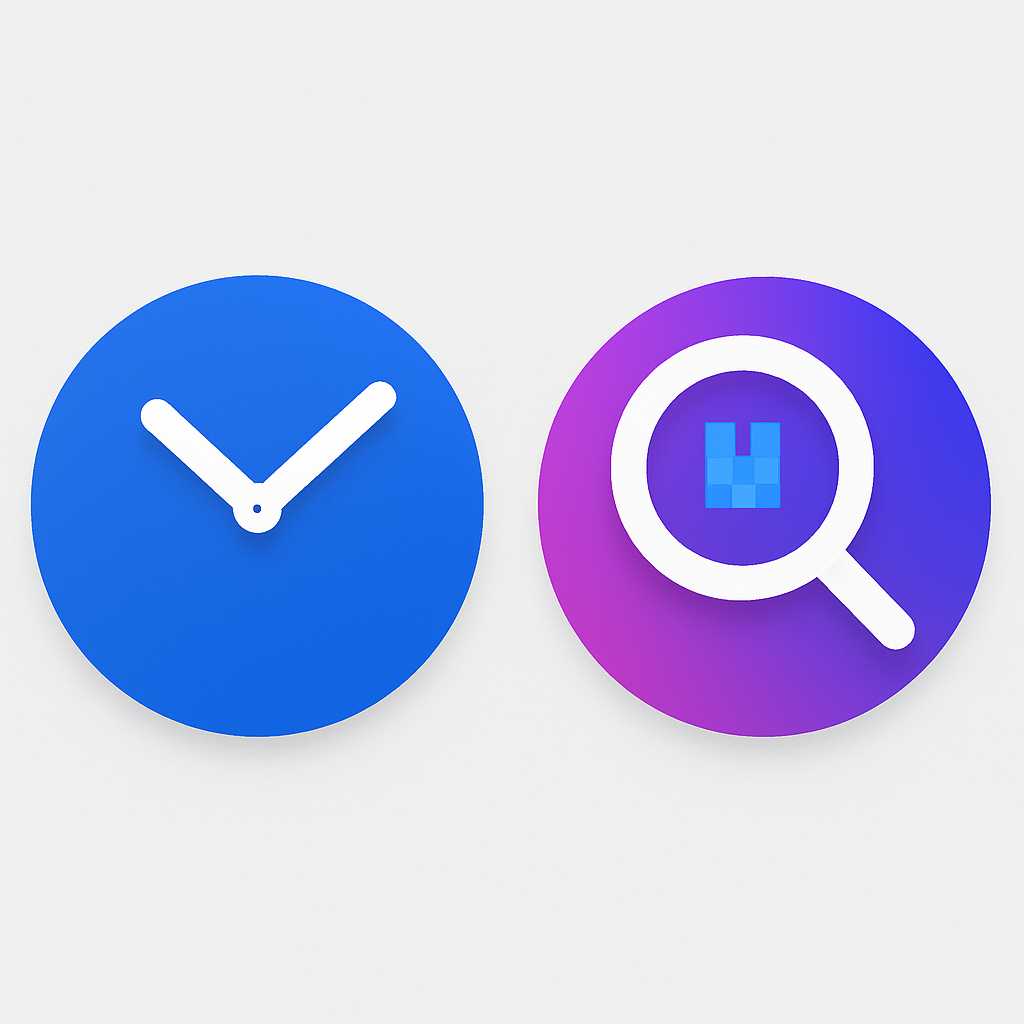
Two of Google’s first-party Android apps—Clock and Pixel Magnifier—have quietly rolled out updated icons as part of the company’s ongoing effort to standardize its visual identity. The clock redesign arrived alongside the Pixel 11 launch under Google Clock version 9.1, while Pixel Magnifier’s refresh is now live in version 2.0.0.965719431. ([9to5google.com](https://9to5google.com/2026/08/24/google-clock-pixel-magnifier-icon-updates/))
What’s changed in the new icons
The new Google Clock icon moves away from border-to-border color and instead features a blue circular face with gradient hour and minute hands styled like those on Pixel Watch faces. It sits against a white square background—a touch that aligns with recent icon design trends seen across other Google apps. ([9to5google.com](https://9to5google.com/2026/08/24/google-clock-pixel-magnifier-icon-updates/)) Old, non-live icons display hands at 9:10, include a half-hour dot marker, and app shortcuts now label alarm setup as “Create alarm/timer” rather than the former “New alarm/timer.” ([9to5google.com](https://9to5google.com/2026/08/24/google-clock-pixel-magnifier-icon-updates/))
Pixel Magnifier also sees a simplified overhaul. Its icon’s blue backdrop has been removed; what remains is a magnifying glass drawn with thicker strokes and a gradient fill inside the square boundary. The Quick Settings Tile for Magnifier has been updated to match the refreshed app icon. There are no other changes to the app’s layout or functionality. ([9to5google.com](https://9to5google.com/2026/08/24/google-clock-pixel-magnifier-icon-updates/))
Where and how the rollouts are expanding
The new version of Google Clock (9.1) is now broadly available via the Play Store, meaning most Android users should see the updated Clock icon on their devices. ([9to5google.com](https://9to5google.com/2026/08/24/google-clock-pixel-magnifier-icon-updates/)) Pixel Magnifier’s refresh (version 2.0.0.965719431) also just began rolling out, so icon changes may show up gradually depending on device and region. ([9to5google.com](https://9to5google.com/2026/08/24/google-clock-pixel-magnifier-icon-updates/))
Neither of these updates includes broader in-app redesigns—everything inside Google Clock and Pixel Magnifier remains visually and functionally unchanged apart from iconography and label tweaks. ([9to5google.com](https://9to5google.com/2026/08/24/google-clock-pixel-magnifier-icon-updates/))
These tweaks reflect Google’s strategy of refining its product visuals without overhauling the user experience. While icon redesigns often draw attention for their aesthetics, consistency across device platforms—phones, watches, Android’s fast settings—can shape perceptions of polish and brand cohesion.