Google Pixel Buds App Introduces Sleek Gradient Icon and Enhanced Device Management
In a recent update, Google has refreshed the Pixel Buds app for Android, introducing a modern gradient icon and a more intuitive device management interface. This enhancement aligns the app’s aesthetics with Google’s broader design language, offering users a cohesive and visually appealing experience.
A Fresh Look: The New Gradient Icon
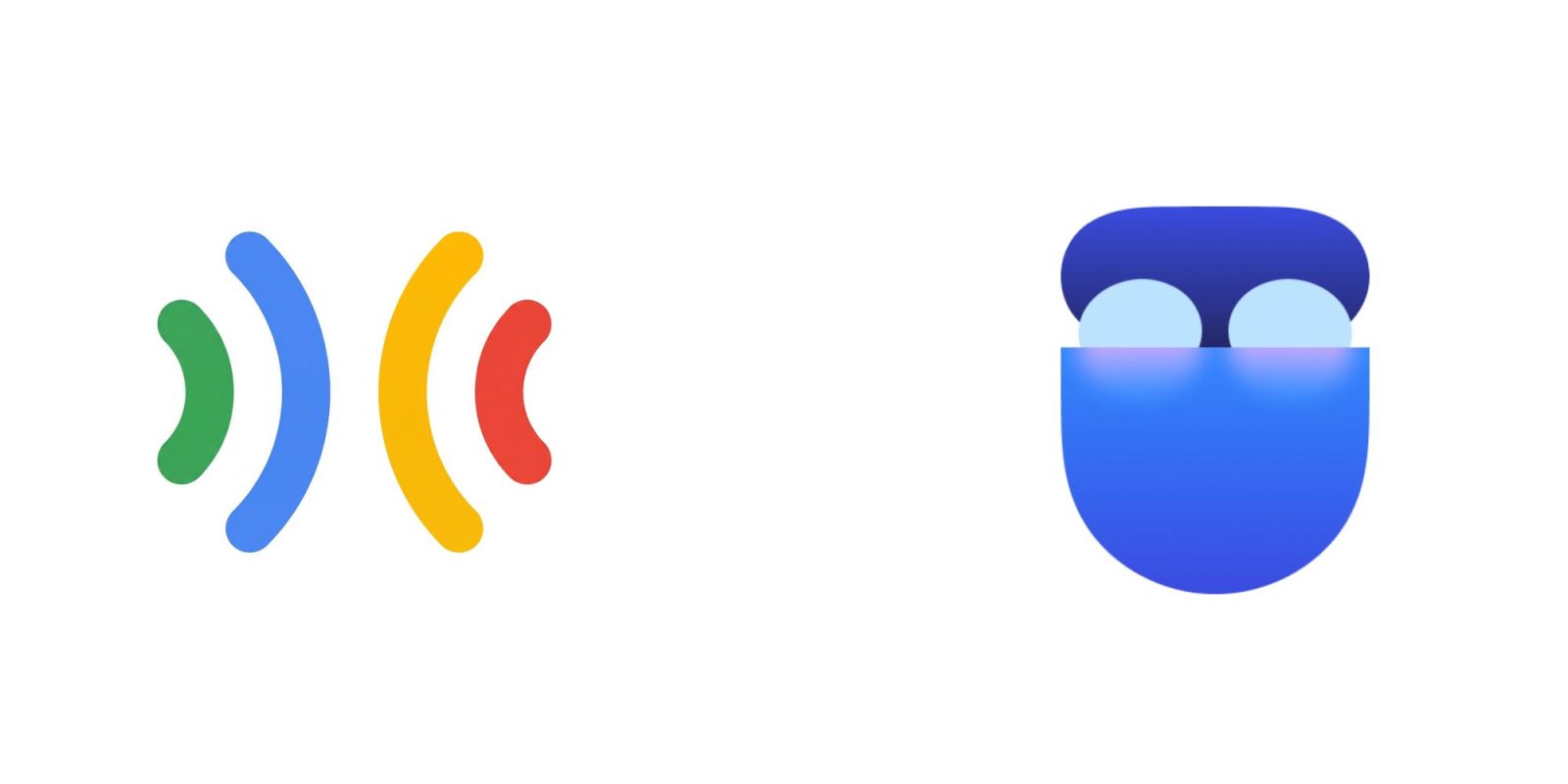
The updated Pixel Buds app now features a gradient icon depicting an open, pebble-shaped case with the earbuds nestled inside. This design employs a blue-purple gradient, consistent with other Google applications such as Pixel Journal and Now Playing. The previous icon, characterized by sound waves in Google’s signature colors, has been replaced to better integrate with the company’s evolving visual identity.
Google’s official statement highlights that the new icon embodies a signature modern color palette, ensuring harmony across the Google ecosystem. This change reflects Google’s commitment to a unified and contemporary design approach across its suite of applications.
Enhanced Device Management: The New Landing Page
For users with multiple pairs of Pixel Buds, the app introduces a new Landing Page designed to streamline device selection and management. This feature displays all paired earbuds in one centralized location, each represented with a background gradient that matches its specific color. This visual cue aids in quick identification and selection of devices.
Google emphasizes that this update responds to user feedback requesting a dedicated and personalized entry point for managing Pixel Buds. The new interface aims to provide a seamless and efficient user experience, catering to the needs of those who own multiple devices.
Availability and Rollout
The updated Pixel Buds app, version 1.0.915175631, is currently rolling out via the Google Play Store. While the update is not yet universally available, users can expect it to reach their devices in the coming days. To check for the update, users can visit the Play Store and navigate to the My apps & games section to see if the new version is available for download.
Contextualizing the Update: Google’s Design Evolution
This update is part of a broader trend within Google to refresh app icons and interfaces to align with its modern design principles. For instance, in May 2025, the Google app for Android received a new ‘G’ icon featuring a gradient that blends red, yellow, green, and blue, reflecting a more contemporary look associated with Google’s AI branding. Similarly, the Pixel Watch app underwent a redesign in October 2025, introducing a new icon and incorporating Material 3 Expressive elements to enhance user experience.
These consistent design updates across Google’s applications signify the company’s dedication to providing a cohesive and aesthetically pleasing user experience. By updating the Pixel Buds app icon and interface, Google continues to refine its ecosystem, ensuring that each component reflects its evolving design philosophy.
User Experience and Feedback
The introduction of the new gradient icon and enhanced device management features are expected to resonate positively with users. The visual consistency across apps not only enhances the aesthetic appeal but also contributes to a more intuitive user experience. The new Landing Page, in particular, addresses the practical needs of users managing multiple devices, simplifying the process of switching between different pairs of Pixel Buds.
User feedback has been instrumental in shaping these updates. Google’s responsiveness to user requests for a dedicated management interface demonstrates its commitment to user-centric design. As these updates roll out, user reactions will provide valuable insights into the effectiveness of these changes and inform future developments.
Looking Ahead: Future Updates and Enhancements
As Google continues to refine its applications, users can anticipate further updates that enhance functionality and design coherence. The company’s focus on integrating user feedback and adhering to modern design standards suggests that future updates will continue to prioritize both aesthetics and usability.
For Pixel Buds users, staying updated with the latest app versions ensures access to new features and improvements. Regularly checking the Play Store for updates and providing feedback can contribute to the ongoing enhancement of the user experience.
Conclusion
The recent update to the Pixel Buds app, featuring a new gradient icon and an improved device management interface, reflects Google’s ongoing commitment to design excellence and user satisfaction. By aligning the app’s aesthetics with its broader ecosystem and addressing user needs, Google enhances the overall experience for Pixel Buds users. As these updates become widely available, users can look forward to a more cohesive and intuitive interaction with their devices.