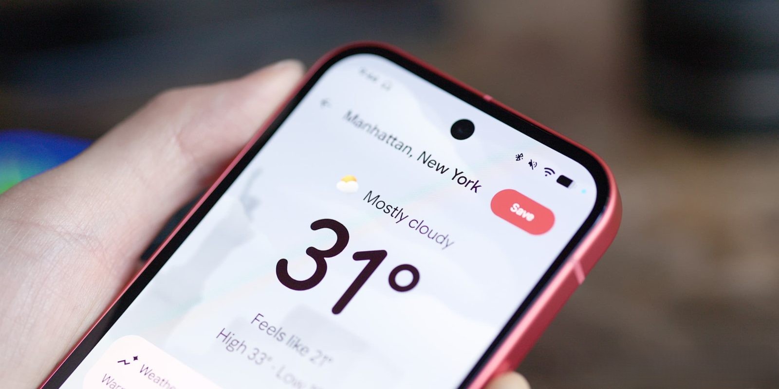
Google is set to enhance the Pixel Weather app with a significant update aimed at improving accessibility and user experience. This update introduces redesigned weather icons that emphasize higher contrast and clarity, making them more distinguishable, especially for users with visual impairments.
The forthcoming version, 1.1.20251230.875325825, will feature these new icons across all weather conditions. The redesign focuses on flat, bold colors and clean outlines, moving away from the previous designs that utilized shadows and gradients to suggest depth. This shift ensures that icons such as the sun and clouds are more prominent against the app’s white background, enhancing visibility. Despite the visual changes, the fundamental shapes of the icons remain consistent, preserving their recognizability.
In addition to the icon overhaul, the update brings a cleaner user interface with richer colors for backdrops and other UI elements. This approach aims to improve contrast and make the app more user-friendly. Furthermore, managing saved locations becomes more straightforward with the introduction of buttons for reordering, eliminating the need for drag-and-drop actions.
While the update is designed to enhance accessibility, some users may prefer the current iconography. Offering an option to switch between the new and existing designs could cater to diverse user preferences.
The rollout of this update is anticipated in the near future, bringing these enhancements to Pixel users soon.