Google has recently rolled out version 4.1.0.810754319 of the Pixel Watch companion app, bringing a refreshed icon and additional Material 3 Expressive (M3E) design elements. This update coincides with the upcoming release of the Pixel Watch 4, enhancing the app’s visual appeal and user experience.
Revamped App Icon
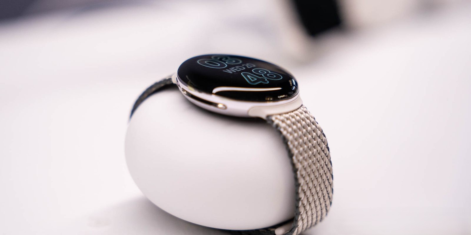
The previous app icon featured a stylized watch in Google’s signature colors: blue, red, yellow, and green. While vibrant, it lacked the sophistication expected from a premium product. The new icon presents a more realistic depiction of the Pixel Watch, capturing the device’s curves, crown, and band with greater accuracy. The hour and minute hands are designed in the pill-shaped Material 3 style, aligning with Google’s latest design language. The color scheme has shifted to a harmonious blend of blue and purple, consistent with recent updates to other Pixel apps, such as the Alarm, Timer, and Stopwatch icons. This change signifies a move towards a unified branding approach for Pixel applications.
Enhanced User Interface with M3 Expressive Design
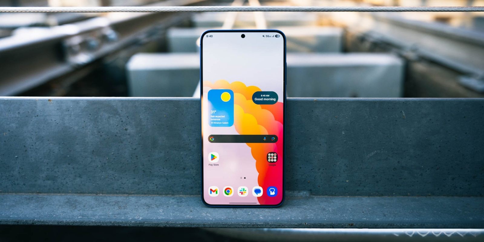
The update introduces a story-like carousel at the top of the main feed, guiding users through key features like Fitbit integration, Personal Safety, Gemini, and Wallet. This interactive element serves as an informative introduction for new users and a quick reference for existing ones. The incorporation of M3E stylings adds a dynamic and engaging visual component to the app.
Submenus within the app have also been redesigned with M3E principles. Each line item is now placed within a container, providing clear visual separation and grouping of related settings. This design approach enhances readability and navigability, making it easier for users to locate and adjust settings. The Tiles screen has received similar treatment, ensuring a cohesive design language throughout the app.
Broader Implications of the Update
This update is part of Google’s broader initiative to implement Material 3 Expressive design across its ecosystem. By adopting M3E, Google aims to create a more flexible and customizable user interface that reflects individual personalities and styles. The design emphasizes personalized colors, fonts, animations, and interactions, allowing users to tailor their experience to evoke specific feelings or moods.
The Pixel Watch app’s redesign aligns with updates to other Google applications. For instance, the Google Clock app recently received an M3E overhaul, featuring a shorter bottom bar, outlined icons, and a more descriptive tab structure. Similarly, the Pixel Buds companion app underwent a redesign, introducing a modernized Equalizer interface and reorganized Sound menu with M3E containers grouping related settings.
These consistent design updates across various applications indicate Google’s commitment to providing a unified and aesthetically pleasing user experience. The focus on M3E design principles ensures that users can enjoy a cohesive interface, whether they’re interacting with their Pixel Watch, Pixel Buds, or other Google services.
Looking Ahead
As Google continues to roll out M3E updates, users can anticipate further enhancements to the visual and functional aspects of their devices. The Pixel Watch app’s latest update not only improves its appearance but also sets the stage for future integrations and features that will leverage the M3E design language.
For Pixel Watch users, this update offers a more refined and user-friendly interface, reflecting Google’s dedication to continuous improvement and user satisfaction. As the Pixel Watch 4 becomes available, these design updates will contribute to a more seamless and enjoyable user experience.