Google has unveiled a significant update to its Clock app for Wear OS, introducing a suite of M3 Expressive app icons for the Alarm, Stopwatch, and Timer functions. This enhancement is part of the broader Material 3 Expressive (M3E) redesign initiative aimed at modernizing the user interface across Google’s applications.
Revamped App Icons
The new icons replace the previous generic designs with more detailed and realistic representations:
– Alarm Icon: The traditional yellow background with a generic alarm symbol has been replaced by a more lifelike clock face. This design incorporates pronounced Material 3 hands at the center, set against a blue backdrop, adding depth and clarity to the icon.
– Stopwatch Icon: Departing from its former red hue, the Stopwatch icon now features a straightforward design that enhances immediate recognition. The color scheme has been updated to align with the cohesive aesthetic of the M3E design language.
– Timer Icon: The Timer icon has undergone a transformation to resemble an actual hourglass, utilizing blue and purple tones with subtle 3D effects to convey the passage of time visually.
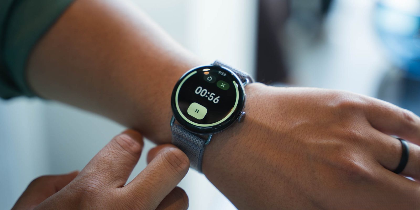
These icon updates are being rolled out with version 6.10.571.x of the Google Clock app for Wear OS. It’s important to note that this update focuses solely on the app icons; the core functionalities and user interfaces of the Alarm, Stopwatch, and Timer apps, as well as their corresponding Tiles, remain unchanged at this time.
Material 3 Expressive Redesign Initiative
The introduction of these new icons is a component of Google’s broader Material 3 Expressive redesign, which aims to modernize and unify the visual language across its suite of applications. This initiative emphasizes cleaner lines, cohesive color schemes, and intuitive design elements to enhance user experience.
In previous updates, other Google applications have received similar M3E enhancements:
– Google Keep: The app underwent a comprehensive redesign, featuring a thicker search app bar, updated floating action buttons (FABs), and a more intuitive notes interface. ([9to5google.com](https://9to5google.com/2025/07/24/google-keep-material-3-expressive/?utm_source=openai))
– Google Messages: The Wear OS version of Google Messages received subtle yet effective M3E updates, including pill-shaped buttons and grouped suggested replies, contributing to a more streamlined messaging experience. ([9to5google.com](https://9to5google.com/2025/07/25/google-messages-wear-os-m3-expressive/?utm_source=openai))
– Google Phone: The Phone app for Wear OS introduced an M3E redesign that included a revamped in-call screen with larger touch targets and repositioned controls for improved usability. ([9to5google.com](https://9to5google.com/2025/07/18/google-phone-wear-os-m3-expressive/?utm_source=openai))
User Experience and Feedback
The updated app icons are designed to provide users with a more visually engaging and intuitive experience. By incorporating realistic and descriptive designs, the icons aim to facilitate quicker recognition and interaction, especially on the compact screens of wearable devices.
Initial user feedback has been positive, with many appreciating the modernized aesthetics and the cohesive design language that the M3E initiative brings to the Wear OS ecosystem. However, some users have expressed a preference for the previous color schemes, highlighting the subjective nature of design preferences.
Future Updates and Expectations
While the current update focuses on app icons, it is anticipated that future releases will extend the M3E redesign to the actual app interfaces and Tiles. Potential enhancements may include:
– User Interface Modernization: Implementing pill-shaped containers for buttons and adopting new shapes to align with the M3E design principles.
– Font and Typography Updates: Introducing updated fonts to improve readability and aesthetic appeal.
– Consistent Design Language: Ensuring that all elements within the app adhere to the cohesive M3E design language for a unified user experience.
These anticipated updates aim to further enhance the usability and visual appeal of the Google Clock app on Wear OS devices.
Conclusion
The introduction of M3 Expressive app icons in the Google Clock app for Wear OS marks a significant step in Google’s ongoing efforts to modernize and unify its application designs. By focusing on realistic and descriptive iconography, this update enhances user interaction and aligns with the broader Material 3 Expressive redesign initiative. As Google continues to roll out these design updates across its suite of applications, users can look forward to a more cohesive and intuitive experience on their Wear OS devices.