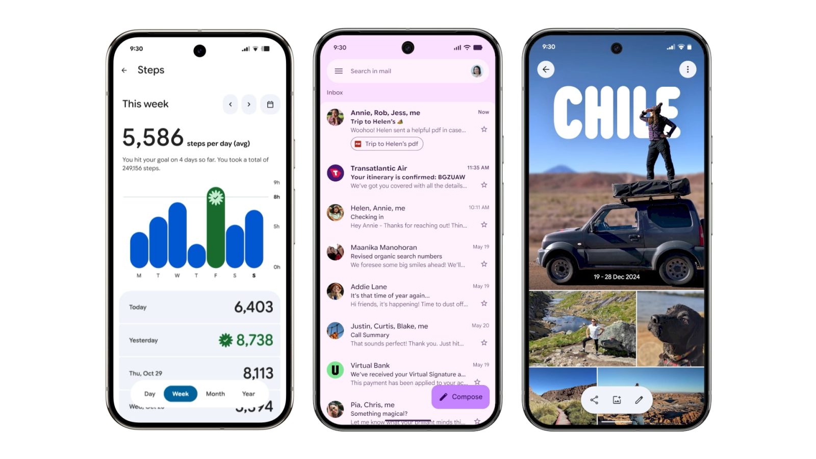
In May 2025, Google unveiled its latest design language, Material 3 Expressive (M3E), marking a significant evolution in the company’s approach to user interface and experience. This design overhaul emphasizes dynamic color schemes, rounded shapes, and a more intuitive user experience. Since its announcement, Google has been progressively integrating M3E across its suite of applications, enhancing both aesthetics and functionality. This article provides an in-depth look at the applications that have embraced the M3E redesign, detailing the specific changes and improvements introduced.
Recent Launches
Pixel Watch II
With the release of the Pixel Watch 4, the companion app underwent a substantial M3E transformation. The initial redesign focused on the homepage, introducing a new icon and incorporating M3E elements. The subsequent phase expanded these changes to all menus, utilizing containers to enhance visual separation and improve user navigation.
Google Wallet
Google Wallet’s interface received a notable M3E update. The Wallet text in the top-left corner was replaced with the app’s logo, and a prominent floating action button (FAB) was introduced for adding items to the wallet. Throughout the app, containers were employed to organize settings and recent activities, providing a cleaner and more organized appearance. Additionally, the NFC tap-to-pay animation was revamped to feature a translucent background with dynamic card movements, offering a more engaging user experience. An overlay for newer Pixel devices was also introduced, enhancing accessibility and functionality.
Google Home
The Google Home app was redesigned to incorporate M3E components, including morphing buttons that adapt when users swipe between different sections. This redesign aimed to create a more cohesive and responsive user interface, aligning with the principles of Material 3 Expressive.
Rolling Out
Gmail II
Gmail is in the process of receiving its second wave of M3E updates. This phase focuses on refining the user interface by introducing more pronounced dynamic color applications and rounded elements, enhancing the overall visual appeal and user experience.
Google Chrome
Google Chrome is gradually adopting M3E elements, with updates being implemented in stages. Users can expect to see changes in the browser’s interface, including updated icons, color schemes, and interactive elements that align with the M3E design principles.
Fully Launched
Digital Wellbeing
The Digital Wellbeing app has fully integrated M3E, featuring a refreshed interface that utilizes dynamic colors and rounded shapes to present data in a more engaging and accessible manner.
Files by Google
Files by Google embraced M3E by introducing a cleaner layout with rounded icons and dynamic color themes, enhancing the file management experience for users.
Find Hub
Find Hub’s redesign under M3E focused on improving navigation through the use of containers and dynamic color schemes, making it easier for users to locate their devices.
Gmail
The initial M3E update for Gmail introduced a more vibrant color palette and rounded interface elements, aligning with the new design language and improving readability and user engagement.
Google Calculator
Google Calculator’s M3E redesign featured larger, rounded buttons and a dynamic color scheme, enhancing usability and visual appeal.
Google Calendar
Google Calendar adopted M3E by implementing a more intuitive layout with dynamic colors and rounded event cards, improving the scheduling experience.
Google Chat
Google Chat’s interface was updated to include rounded message bubbles and dynamic color themes, creating a more engaging and cohesive chat experience.
Google Clock
The Google Clock app underwent a significant M3E transformation, introducing a shorter bottom bar, outlined icons, and a more descriptive tab layout. The Alarms tab now highlights active alarms with a bright background, and customization is handled through a sliding sheet. The Stopwatch tab features large buttons for Stop, Reset, and Lap functions, replacing previous side-by-side icons. Lap times are now displayed in card format, and the ring motif has been removed. These changes aim to enhance usability and align with the M3E design principles.
Google Contacts
Google Contacts embraced M3E by introducing rounded contact photos, dynamic color schemes, and a more organized layout, improving the user experience in managing contacts.
Google Docs, Sheets, and Slides
The suite of productivity apps adopted M3E by implementing dynamic color themes, rounded interface elements, and improved collaboration features, enhancing the overall user experience.
Google Drive
Google Drive’s M3E redesign focused on a cleaner interface with rounded icons and dynamic colors, improving file navigation and management.
Google Keep
Google Keep’s integration of M3E introduced a thicker search app bar, a new Sort by option, and pill-shaped icons for various functions. The floating action button (FAB) was tweaked to display icons first, and buttons within notes were placed in containers for better organization. These updates aimed to enhance usability and align with the M3E design language.
Google Maps
Google Maps adopted M3E by introducing dynamic color schemes and rounded interface elements, improving the navigation experience and visual appeal.
Google Meet
Google Meet’s interface was updated with M3E elements, including dynamic colors and rounded buttons, enhancing the video conferencing experience.
Google Messages
Google Messages began rolling out M3E updates, starting with the chat interface. The conversation screen now places message threads in containers with rounded corners, separating the app bar as its own layer. The ‘plus’ menu is a separate container with pill-shaped icons for various functions. These changes aim to create a more cohesive and user-friendly messaging experience.
Google One
Google One’s M3E redesign introduced dynamic color themes and rounded interface elements, improving the user experience in managing storage and subscriptions.
Google Password Manager
Google Password Manager adopted M3E by implementing dynamic colors and rounded interface elements, enhancing the security management experience.
Google Photos
Google Photos’ albums view was redesigned with a Material 3 Expressive toolbar, replacing the previous design. The floating toolbar allows users to share, add photos, and edit albums more efficiently. The Edit view now features a docked toolbar for adding photos, text, and locations, with cards for editing highlights and album covers. These updates aim to provide a cleaner and more intuitive photo management experience.
Google TV
Google TV’s interface was updated with M3E elements, including dynamic colors and rounded icons, enhancing the content browsing experience.
My Pixel
My Pixel app embraced M3E by introducing dynamic color schemes and rounded interface elements, improving the user experience in managing Pixel devices.
Phone by Google
The Google Phone app underwent a significant M3E redesign, consolidating the Favorites and Recents tabs into a single Home tab. Starred contacts now appear in a carousel at the top of the call list, with each conversation placed in a container. The Keypad tab replaces the floating action button, and the sheet containing the number pad now features rounded corners. The in-call interface utilizes pill-shaped buttons that morph into rounded rectangles when selected, with a larger end call button for improved usability. These changes aim to streamline navigation and enhance the calling experience.
Pixel Buds
Pixel Buds app adopted M3E by implementing dynamic colors and rounded interface elements, improving the user experience in managing earbuds.
Pixel Recorder
Pixel Recorder’s interface was updated with M3E elements, including dynamic colors and rounded buttons, enhancing the recording experience.
Pixel Screenshots
Pixel Screenshots received minor M3E tweaks, including a rounded square floating action button and adjusted shapes for image previews, aligning with the new design language.
Pixel Studio
Pixel Studio app embraced M3E by introducing dynamic color schemes and rounded interface elements, improving the user experience in creative projects.
Pixel VIPs
Pixel VIPs app adopted M3E by implementing dynamic colors and rounded interface elements, enhancing the user experience in managing VIP contacts.
Pixel Watch
Pixel Watch app’s interface was updated with M3E elements, including dynamic colors and rounded buttons, improving the smartwatch management experience.
Pixel Weather
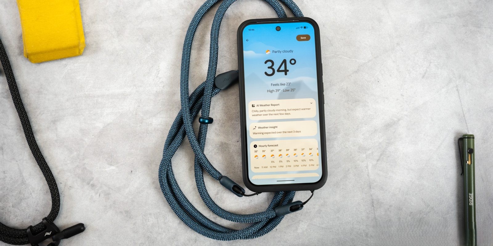
Pixel Weather app embraced M3E by introducing dynamic color schemes and rounded interface elements, enhancing the weather information experience.
Quick Share
Quick Share app adopted M3E by implementing dynamic colors and rounded interface elements, improving the file sharing experience.
Conclusion
Google’s Material 3 Expressive redesign represents a significant shift towards a more dynamic, intuitive, and visually cohesive user experience across its suite of applications. By integrating M3E elements such as dynamic color schemes, rounded shapes, and improved navigation, Google aims to provide users with a more engaging and seamless interaction with its services. As the rollout continues, users can anticipate further enhancements and a unified design language that reflects Google’s commitment to innovation and user-centric design.


