In May 2025, Google unveiled its latest design language, Material 3 Expressive (M3E), marking a significant evolution in the company’s approach to user interface and experience. This redesign emphasizes personalization, fluidity, and a more engaging aesthetic across Google’s suite of applications. Since its announcement, several Google apps have begun integrating M3E, each bringing unique enhancements to the user experience.
Google Drive:
The M3E update for Google Drive introduces a more cohesive and streamlined interface. The search app bar has been refined, and the list/grid content view is now encapsulated within a unified container. A connected button group facilitates seamless switching between list and grid views, enhancing usability. This redesign aims to provide a more intuitive and visually appealing experience for users managing their files and documents.
Gmail:
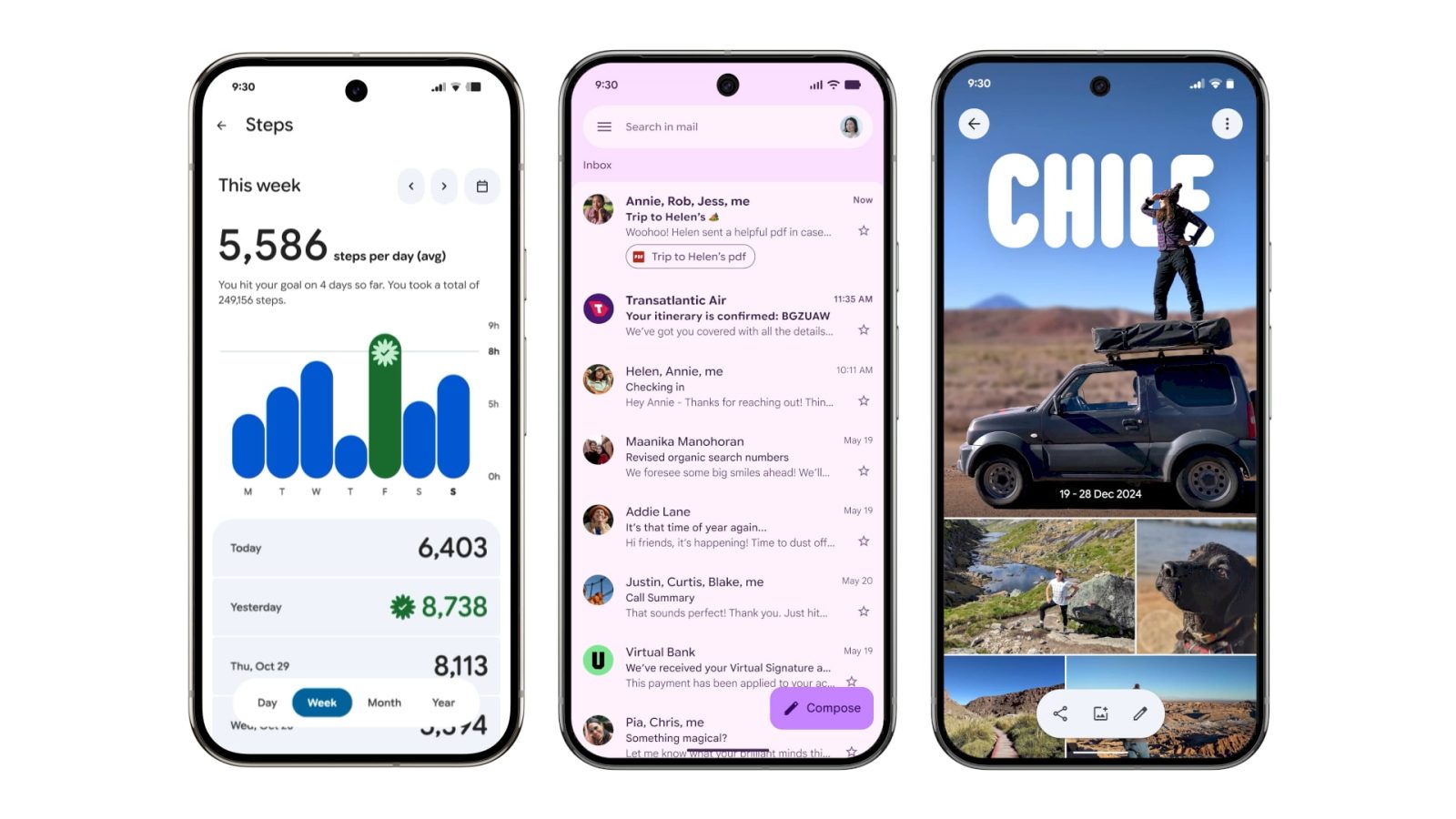
Gmail’s adoption of M3E brings noticeable changes to its interface. Emails and messages are now displayed within distinct containers, offering a cleaner and more organized look. Swipe gestures have been enhanced with prominent pill-shaped animations, providing clear visual feedback. Additionally, the search app bar has been updated, moving the hamburger menu and profile switcher outside the field, which has been thickened for better accessibility. These changes collectively contribute to a more modern and user-friendly email experience.
Google Wallet:
The Google Wallet app has undergone a significant transformation under the M3E design principles. The app now features the Google Wallet logo in the top-left corner, replacing the previous Wallet text. Passes are displayed on thicker cards, improving readability and aesthetics. The Recent Activity page has been updated with containers, and the NFC tap-to-pay animation has been revamped to be more dynamic and engaging. For Pixel users, a new overlay has been introduced for the double-tap power button gesture, enhancing the overall payment experience.
Digital Wellbeing:
The Digital Wellbeing app within Settings has received a subtle yet effective M3E update. The main page now features containers, and the donut graph representing screen time usage has been thickened for better visibility. These changes aim to provide users with a clearer understanding of their digital habits, promoting healthier device usage.
Google Photos:
Google Photos has embraced the M3E design with a new backup indicator at the top of the app, replacing the previous Google Photos text. Upon launching the app, users are greeted with a brief animation, adding a touch of dynamism to the experience. These updates contribute to a more engaging and visually appealing photo management interface.
Google One:
The Google One app’s M3E redesign focuses on simplifying the interface by removing unnecessary graphics and emphasizing content. The bottom navigation bar has been updated to a shorter style, aligning with the new design language. The Settings list now features large headers and grouped items within cards, providing a more organized and user-friendly experience. Notably, the app has shifted away from Dynamic Color, opting for a consistent gray theme, which may be subject to further updates.
Phone by Google:
The Phone app’s M3E update introduces a reorganization of its interface. The Favorites tab has been merged with Recents, now presented as a carousel at the top of the Home feed. The dialer floating action button has been replaced with a Keypad tab in the bottom navigation bar. Additionally, a navigation drawer has been added, housing Contacts, Settings, Clear call history, and Help & feedback options. These changes aim to streamline the calling experience and improve accessibility.
Google Keep:
Google Keep’s integration of M3E brings a refreshed look to note-taking. The app now features containers for notes, providing a cleaner and more organized appearance. The bottom navigation bar has been updated to a shorter style, and the search bar has been refined for better usability. These enhancements aim to make note management more intuitive and visually appealing.
Google Messages:
The Google Messages app has begun rolling out M3E updates to its chat interface. Conversations are now displayed within containers with rounded corners, separating the message thread from the app bar. The ‘plus’ menu has been redesigned with pill-shaped containers for options like Gallery, GIFs, and Stickers, and the emoji menu now features a connected button group for switching between different media types. These changes contribute to a more modern and user-friendly messaging experience.
Google Contacts:
The Google Contacts app has received a significant M3E update, introducing individual colored containers for each contact to improve visibility. The Highlights and Organize tabs also adopt these new containers, while the Create contact interface remains unchanged. Notably, the contact info page now features larger, pill-shaped action buttons for Call, Message, Video, and Email, enhancing usability. These updates reflect Google’s commitment to a more expressive and user-friendly interface across its applications.
Google Calendar:
Google Calendar’s M3E redesign introduces a visual overhaul aimed at improving clarity and usability. Time slots are now presented in containers with solid backgrounds that adapt dynamically to the device’s wallpaper, enhancing visibility and contrast. The Month view features days separated with rounded corners, providing a more structured appearance. While some sections, like event creation and settings, retain the previous design, these updates mark a significant step toward a more cohesive and modern calendar experience.
Google Docs, Sheets, and Slides:
The suite of productivity apps—Google Docs, Sheets, and Slides—has embraced M3E with various interface tweaks. The editor interface now features a new progress indicator with a wavy circular design, providing clear visual feedback during loading. Pill-shaped buttons themed with Dynamic Color have been introduced for sharing and editing completion. The Format sheet utilizes pill-shaped dropdown menus, and the split button component is now used for bulleted and numbered lists, enhancing the overall editing experience.
Google Meet:
Google Meet’s M3E update focuses on enhancing usability with larger touch targets. Past calls are now displayed in containers with more rounded corners, and profile images have been increased in size. The pre-call screen features significantly larger buttons for voice and video calls, making them easier to interact with. These changes aim to improve the user experience during virtual meetings.
Material 3 Expressive Design Language:
Material 3 Expressive represents a significant shift in Google’s design philosophy, emphasizing personalization, fluidity, and a more engaging aesthetic. Key components of M3E include:
– Navigation Bars: The traditional navigation drawer is being deprecated in favor of navigation rails, which adapt better across various window sizes. This change aims to provide a more consistent navigation experience across devices.
– Floating Toolbars: M3E introduces floating toolbars that display frequently used actions relevant to the current page. These toolbars can be customized and are available in docked and floating configurations, enhancing accessibility and usability.
– Progress Indicators: The new loading indicator features a wavy circular design, providing clear visual feedback during loading processes. This component is already being integrated into various Google apps, contributing to a more cohesive user experience.
– Widgets: Google Drive’s Suggested files widget has been updated with M3E, featuring a rounded rectangle design with the app logo and quick action buttons. This redesign aims to provide a more intuitive and visually appealing widget experience.
Conclusion:
Google’s Material 3 Expressive redesign marks a significant evolution in the company’s approach to user interface and experience. By emphasizing personalization, fluidity, and a more engaging aesthetic, M3E aims to provide a cohesive and modern experience across Google’s suite of applications. As these updates continue to roll out, users can expect a more intuitive and visually appealing interaction with their favorite Google apps.