In May 2025, Google unveiled Material 3 Expressive, a significant evolution of its design language aimed at enhancing user experience across Android and Wear OS platforms. This redesign emphasizes personalization, fluid animations, and a cohesive aesthetic, marking a substantial shift in Google’s approach to interface design.
Introduction to Material 3 Expressive
Building upon the foundation laid by Material You, Material 3 Expressive introduces a suite of features designed to make interactions more intuitive and visually engaging. Key elements include:
– Dynamic Color Themes: Users can customize their devices with color schemes that adapt to their preferences, ensuring a personalized look and feel.
– Fluid Animations: The interface now boasts natural, springy animations that respond to user interactions, providing a sense of depth and responsiveness.
– Emphasized Typography: Clear and distinct typography enhances readability and guides users through the interface seamlessly.
– Enhanced Haptic Feedback: Improved tactile responses make interactions more satisfying and intuitive.
Rollout Across Google Applications
Since its announcement, Google has been progressively integrating Material 3 Expressive into its suite of applications. Here’s a detailed look at the updates:
1. Google Calendar
The Calendar app has undergone a visual transformation:
– Time Slot Containers: Time slots are now enclosed in rounded containers, replacing the previous faint lines. This change enhances clarity and visual appeal.
– Dynamic Backgrounds: The app features solid background layers that adapt to the primary dynamic color, offering a cohesive aesthetic.
– View Enhancements: Various views, including Day, Week, and Month, have been updated to reflect the new design language, improving user navigation and experience.
2. Google Contacts
The Contacts app has received a straightforward redesign:
– Containerization: Elements are now placed within containers, providing a structured and organized layout.
– Bottom Bar Adjustments: The bottom navigation bar has been shortened, optimizing screen space and usability.
– Color Tweaks: Subtle background color adjustments align the app with the overall Material 3 Expressive theme.
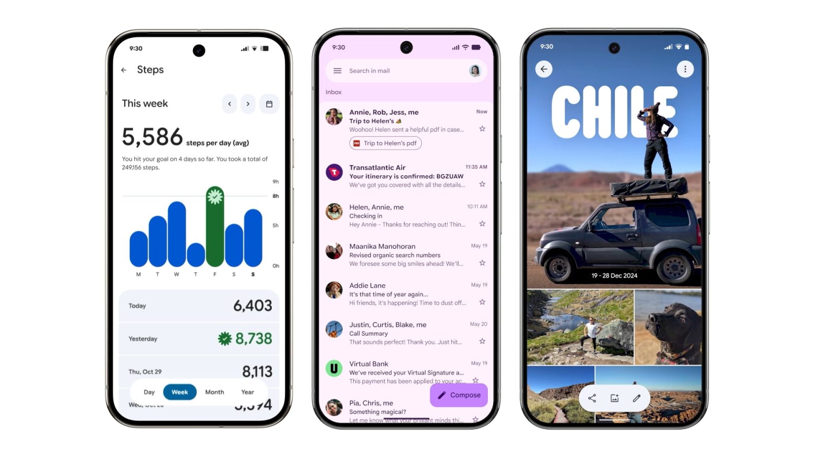
3. Digital Wellbeing
The Digital Wellbeing interface within the Settings app has been refreshed:
– Main Page Update: The primary page now features containers that group related information, enhancing readability.
– Graphical Enhancements: The donut graph representing usage statistics has been thickened, making data visualization more prominent and accessible.
4. Google Photos
Google Photos has introduced several user-centric updates:
– Backup Indicator: A new indicator at the top replaces the Google Photos label, providing real-time backup status.
– Animated Logo: Upon launch, the app displays an animated logo that transitions into a Backup complete message, offering immediate feedback.
– Pull-to-Refresh Feature: Users can pull down to refresh, revealing dynamic Material 3 Expressive shapes and storage information, adding a layer of interactivity.
– Progress Indicators: During backups, a wavy progress indicator provides a visual cue of ongoing processes.
5. Google One
The Google One app has been streamlined:
– Bottom Bar Redesign: A shorter bottom navigation bar enhances accessibility and screen utilization.
– Prominent Containers: Cards and settings are now placed within more noticeable containers, improving the visual hierarchy.
– Infographic Removal: The app has removed previous infographics, resulting in a denser, more information-focused interface.
6. Phone by Google
The Phone app has undergone a comprehensive overhaul:
– Navigation Simplification: The bottom bar has been reduced from four tabs to three, consolidating Favorites and Recents into a unified Home tab.
– Keypad Integration: A new Keypad tab replaces the floating action button (FAB), streamlining the dialing process.
– Visual Consistency: The redesign aligns the app with Material 3 Expressive principles, ensuring a cohesive user experience.
7. Google Keep
Google Keep has embraced the new design language:
– Containerized Notes: Notes are now displayed within rounded containers, enhancing visual organization.
– Dynamic Color Integration: The app’s color scheme adapts to user preferences, providing a personalized experience.
– Typography Enhancements: Emphasized typography improves readability and user engagement.
8. Google Wallet
The Wallet app has been updated to reflect Material 3 Expressive:
– Modernized Interface: The app features a simplified, modern design that aligns with the new aesthetic.
– Container Usage: Elements are placed within containers, providing a structured and organized layout.
– Color Scheme Updates: The app’s color palette has been adjusted to match dynamic color themes, enhancing visual appeal.
9. Google Messages
Google Messages has received a visual refresh:
– Chat Bubbles: Messages are now displayed within rounded chat bubbles, improving readability and aesthetics.
– Dynamic Color Themes: The app’s color scheme adapts to user preferences, providing a personalized experience.
– Typography Enhancements: Emphasized typography improves readability and user engagement.
10. Gmail
Gmail has been updated with several design enhancements:
– Card-Based UI: Emails and the search bar are now displayed within cards with rounded corners, providing a structured and organized layout.
– Compose Button Redesign: The Compose floating action button has been updated with a thicker font and solid-filled pencil icon, enhancing visibility.
– Search Bar Adjustments: The search bar has been reduced in size, making room for a dedicated profile icon beside it.
– Bottom Bar Enhancements: The bottom navigation bar has been slightly enlarged, with larger Meet and Email icons for improved accessibility.
– Swipe Gestures: Swipe gestures now feature pill-shaped button animations, adding a dynamic element to the interface.
Implementation Timeline
The rollout of Material 3 Expressive is being conducted in phases:
– Beta Releases: Initial updates are available to beta testers, allowing Google to gather feedback and make necessary adjustments.
– Gradual Deployment: Following successful beta testing, updates are gradually deployed to the general user base to ensure stability and user satisfaction.
– Continuous Updates: Google continues to refine and expand the redesign across its suite of applications, with ongoing updates expected in the coming months.
Conclusion
Material 3 Expressive represents a significant step forward in Google’s design philosophy, emphasizing personalization, fluidity, and user engagement. As the redesign continues to roll out across various applications, users can anticipate a more cohesive and visually appealing experience that aligns with modern design standards.