Google’s Gemini: Redefining AI Interaction with Gradient Design
In the ever-evolving landscape of artificial intelligence, Google has introduced Gemini, an AI assistant that reimagines user interaction through innovative design elements. Central to Gemini’s interface is the strategic use of gradients, a design choice that draws inspiration from the pioneering graphical user interface of the 1984 Macintosh.
Bridging the Gap Between Users and AI
The inception of the Macintosh in 1984 marked a significant shift in computing, making digital processes more accessible to the general public. Designer Susan Kare played a pivotal role in this transformation by creating intuitive icons—such as the smiling computer face—that served as bridges between human understanding and machine logic. These simple visual metaphors demystified complex digital operations, making technology more approachable.
Google identifies a parallel challenge with Gemini. As AI continues to evolve, there exists a conceptual gap in user understanding and trust. To address this, Google seeks to create a design language for Gemini that is both accessible and reassuring, much like Kare’s icons were for early computer users.
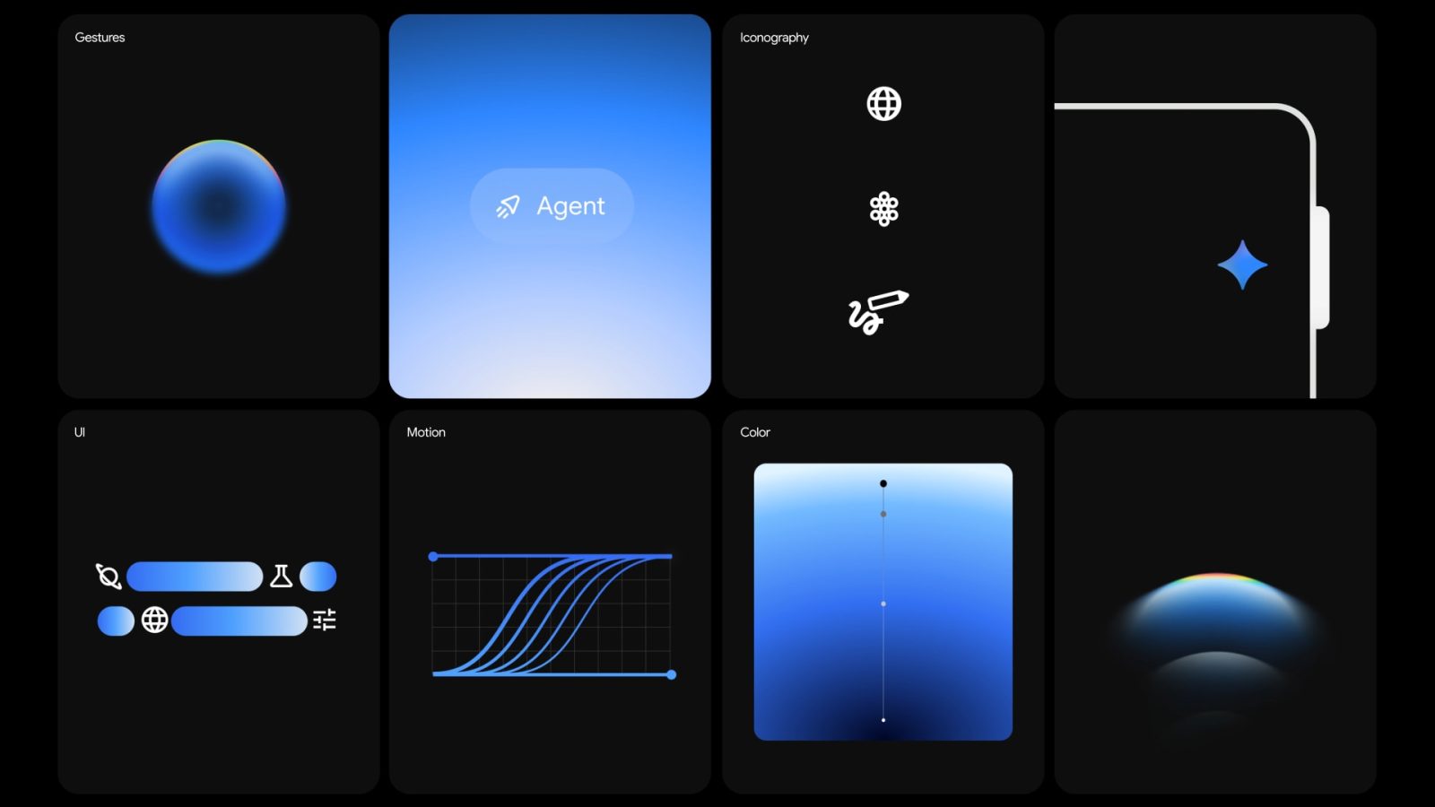
The Role of Gradients in Gemini’s Design
Gradients in Gemini are not merely aesthetic choices; they serve functional purposes that enhance user experience:
1. Guiding User Attention: The gradients feature sharp, almost opaque leading edges that gradually diffuse. This design directs users’ focus toward essential elements, ensuring a seamless interaction.
2. Conveying Energy and Motion: The dynamic nature of gradients symbolizes the transfer of energy and momentum, reflecting Gemini’s active thinking and synthesis processes. This visualization makes the AI assistant feel more alive and responsive.
3. Personifying the AI Experience: By incorporating gradients, Gemini’s design moves beyond static interfaces, offering a sense of motion and adaptability. This approach helps personify the AI, making interactions feel more natural and less mechanical.
Design Elements and Their Significance
Beyond gradients, Gemini’s design incorporates several key elements:
– Circular Motifs: The fundamental shape of the circle is prevalent in Gemini’s design. Circles convey simplicity, harmony, and comfort. Notably, Gemini’s logo is crafted from the negative space of four adjoining circles, emphasizing unity and balance.
– Motion and Animation: Animations within Gemini have defined start and end points, creating a directional flow that mirrors user actions. This responsiveness helps users intuitively understand that the system is working with them. Inner activities within the motion convey thinking, analysis, and intelligence, making Gemini’s processing feel more transparent.
– Softness in Interaction: To counteract the potential intimidation of advanced AI, Gemini’s design emphasizes softness. This is achieved through guided, pulsing gradient shapes, clear language, and transparent signaling. Such design choices ensure that users feel secure and supported during their interactions.
Practical Applications and User Experience
The integration of these design principles is evident in various aspects of Gemini:
– Activation Animations: When users engage with Gemini—be it by holding the power button or swiping from a corner—the activation animations are designed to be intuitive and engaging. These animations, inspired by Material 3 Expressive shapes, provide visual cues that guide users seamlessly into the AI experience.
– Loading Animations: Before presenting greetings and suggestions, Gemini employs morphing animations on its homepage. These animations, inspired by Material 3 Expressive shapes, offer a visual representation of the AI’s thought process, enhancing transparency and user trust.
– Overlay Interfaces: On Android devices, Gemini’s overlay interfaces utilize gradients and motion to create a cohesive and immersive user experience. This design ensures that interactions with the AI feel integrated and natural within the broader device ecosystem.
Conclusion
Google’s Gemini represents a thoughtful fusion of design and technology, aiming to make AI interactions more intuitive and human-centric. By drawing inspiration from historical design successes and incorporating modern elements like gradients, motion, and softness, Gemini sets a new standard for AI assistant interfaces. This approach not only enhances usability but also fosters trust and comfort among users, bridging the gap between human understanding and machine intelligence.