Google is in the process of redesigning the account switcher interface across its suite of Android applications, transitioning from a compact overlay to a fullscreen experience. This change, while aligning with Google’s Material 3 Expressive design language, has sparked discussions regarding its practicality and impact on user experience.
The Evolution of Google’s Account Switcher
Traditionally, when users tapped their profile image in the top-right corner of Google’s first-party apps, a dropdown menu would appear, overlaying the current screen. This design allowed users to switch accounts or access account settings without losing sight of their ongoing tasks. The background would dim slightly, but the primary content remained visible, maintaining context and continuity.
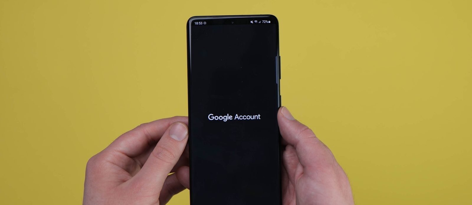
The new design, however, replaces this overlay with a fullscreen interface. Upon tapping the profile image, users are greeted with a large profile picture, a personalized greeting, and prominent options such as Manage your Google Account. The background adopts Dynamic Color theming, and an ‘X’ button in the top-right corner allows users to exit the interface. This design is currently being implemented in apps like Gmail for Android, starting with version 2024.11.24.x.
Assessing the Fullscreen Design
While the fullscreen approach aims to provide a more immersive and consistent experience across devices, it introduces several challenges:
1. Loss of Context: By occupying the entire screen, the new design obscures the content users were interacting with, potentially disrupting workflow and causing confusion.
2. Redundancy: Elements like the large profile image and personalized greeting may be unnecessary for users who are already familiar with their accounts, leading to a perception of wasted space.
3. Navigation Disruption: In applications where the account menu also houses essential features—such as settings, offline maps, or location sharing in Google Maps—the fullscreen design separates these elements from the main interface, potentially hindering intuitive navigation.
User Reactions and Feedback
The reception to this redesign has been mixed. Some users appreciate the aesthetic alignment with Google’s broader design language, while others find the fullscreen takeover excessive and disruptive. Concerns have been raised about the potential for increased cognitive load and the interruption of established workflows.
Potential Implications for Other Google Apps
If this design is extended to other Google applications, similar issues may arise. For instance, in apps like Google Drive or YouTube, where quick account switching is often necessary, the fullscreen interface could slow down user interactions and reduce efficiency.
Conclusion
While Google’s intention to create a cohesive and visually appealing interface is commendable, the shift to a fullscreen account switcher on Android may not align with the practical needs of all users. Balancing design aesthetics with functionality is crucial, and it remains to be seen how Google will address the feedback from its user base regarding this change.