Google’s Material 3 Expressive (M3E) design language is transforming the user experience across its suite of applications, introducing a more cohesive and visually engaging interface. This comprehensive redesign emphasizes dynamic color schemes, rounded elements, and intuitive navigation, enhancing both aesthetics and functionality.
Google Docs, Sheets, and Slides
The homepages of Google Docs, Sheets, and Slides have been updated to reflect the M3E design principles. Users will notice a refreshed search app bar and a prominent floating action button (FAB) that stands out with dynamic color theming. These changes aim to streamline document creation and navigation, providing a more intuitive user experience.
Fitbit App
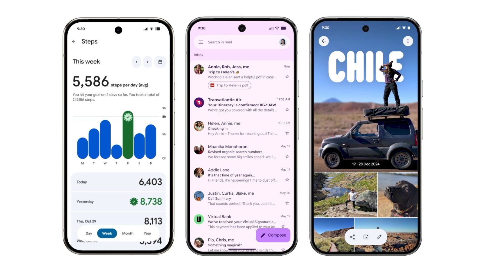
The upcoming Fitbit app is set to receive a complete M3E overhaul. This redesign introduces a contained loading indicator, various M3E shapes, and a floating toolbar on metric pages, offering users a more engaging and visually appealing interface.
Digital Wellbeing
The main page of Digital Wellbeing within the Settings app has been updated with M3E elements. Notable changes include the use of containers and a thicker donut graph, providing a clearer and more informative display of user data.
Files by Google
Files by Google now features an animated M3E carousel on the homepage, accompanied by a pill-shaped toolbar for Quick Share and document scanning. The introduction of a navigation rail and larger previews in list views enhances usability and accessibility.
Gmail
Gmail’s M3E redesign brings a more modern and cohesive look to the email client. The update includes dynamic color theming, rounded elements, and improved navigation, making email management more intuitive and visually appealing.
Google Calendar
Google Calendar has been updated with M3E design elements, including dynamic color schemes and rounded shapes. These changes enhance the visual appeal and usability of the calendar, making it easier for users to manage their schedules.
Google Chat
Google Chat’s M3E redesign introduces a more cohesive and visually engaging interface. The update includes dynamic color theming and rounded elements, improving the overall user experience.
Google Chrome
Google Chrome has been updated with M3E design elements, including dynamic color schemes and rounded shapes. These changes enhance the visual appeal and usability of the browser, providing a more modern browsing experience.
Google Clock
Google Clock 8.1 introduces a comprehensive M3E redesign. The update features a shorter bottom bar, outlined icons that fill upon selection, and descriptive labels for tabs like Alarms and Timers. The Alarms tab now highlights active alarms with a bright background, and customization options are presented through a sheet instead of inline controls. The Stopwatch tab has been overhauled with large buttons for Stop, Reset, and Lap functions, replacing the previous side-by-side icons. Lap times are now displayed in card format, and the ring motif has been removed. These changes aim to enhance usability and provide a more intuitive user experience.
Google Contacts
Google Contacts has been updated with M3E design elements, including dynamic color schemes and rounded shapes. These changes enhance the visual appeal and usability of the app, making it easier for users to manage their contacts.
Google Drive
Google Drive’s scanner editor has been redesigned with M3E elements. The update includes larger page previews, a fullscreen experience for swiping between pages, and a new tools carousel for editing options. These changes aim to improve the document scanning and editing experience.
Google Home
Google Home has been updated with M3E design elements, including dynamic color schemes and rounded shapes. These changes enhance the visual appeal and usability of the app, providing a more modern interface for managing smart home devices.
Google Keep
Google Keep’s M3E redesign introduces background color changes and a thicker search app bar that initially displays Google Keep before transitioning to Search Keep. The interface now includes a single or multi-column switcher and a new Sort by option. The floating action button (FAB) has been tweaked to display icons for Audio, Image, Drawing, List, or Text. Notes now feature pin, reminders, and archive buttons placed in rounded squares in the top-right corner. At the bottom, plus, color/background, and formatting options are placed in circles, while the overflow menu is presented in a pill shape. These updates aim to enhance the note-taking experience by providing a more organized and visually appealing interface.
Google Maps
Google Maps has been updated with M3E design elements, including dynamic color schemes and rounded shapes. These changes enhance the visual appeal and usability of the app, providing a more modern interface for navigation and location services.
Google Meet
Google Meet’s M3E redesign introduces a more cohesive and visually engaging interface. The update includes dynamic color theming and rounded elements, improving the overall user experience during virtual meetings.
Google Messages
Google Messages has begun rolling out an M3E redesign of the chat interface. The conversation screen now places the message thread in a container with rounded corners at the top, separating it from the app bar. The ‘plus’ menu has been updated with pill-shaped containers for Gallery, GIFs, Stickers, etc., and the emoji menu features a connected button group for switching between Emoji, GIFs, Stickers, and Photomoji. These changes aim to provide a more organized and visually appealing messaging experience.
Google One
Google One has been updated with M3E design elements, including dynamic color schemes and rounded shapes. These changes enhance the visual appeal and usability of the app, providing a more modern interface for managing storage and subscriptions.
Google Password Manager
Google Password Manager has been updated with M3E design elements, including dynamic color schemes and rounded shapes. These changes enhance the visual appeal and usability of the app, providing a more modern interface for managing passwords securely.
Google Photos
Google Photos has redesigned the albums view with an M3E toolbar. The previous design’s Add description field and buttons for Share, Add photos, and Order photos have been replaced by a floating toolbar. This toolbar allows users to Share, Add photos, and Edit the album, with the Edit option previously located in the overflow menu. The Sort photos button has been elevated to the top bar, and the Edit view now features a docked toolbar for adding photos, text, and locations. These updates aim to streamline album management and enhance the user experience.
Google TV
Google TV has been updated with M3E design elements, including dynamic color schemes and rounded shapes. These changes enhance the visual appeal and usability of the app, providing a more modern interface for browsing and streaming content.
Google Wallet
Google Wallet’s M3E redesign introduces a more modern and cohesive look to the app. The update includes dynamic color theming, rounded elements, and improved navigation, enhancing the overall user experience for managing digital payments and passes.
My Pixel
My Pixel has been updated with M3E design elements, including dynamic color schemes and rounded shapes. These changes enhance the visual appeal and usability of the app, providing a more modern interface for managing Pixel devices.
Phone by Google
The Google Phone app has undergone a significant M3E redesign, merging the Favorites and Recents tabs into a single Home tab. Starred contacts now appear in a carousel at the top of the past calls list, with each conversation placed in a container. The Keypad tab replaces the floating action button (FAB), and the sheet containing the number pad now features rounded corners. Contacts have been moved into a new navigation drawer accessed from the search field. The incoming call screen has been updated with options to answer or decline via horizontal swipe or single tap, reducing accidental actions. The in-call interface now uses pill-shaped buttons that morph into rounded rectangles when selected, with a larger end call button for improved usability.
Pixel Buds
Pixel Buds have been updated with M3E design elements, including dynamic color schemes and rounded shapes. These changes enhance the visual appeal and usability of the app, providing a more modern interface for managing Pixel Buds settings.
Pixel Camera
Pixel Camera 10.1 brings M3E tweaks to older devices. The viewfinder now features a solid circle capture button with a transparent ring, and the buttons flanking it are rounded squares. The preview of the last image has a new animation reminiscent of a photo booth. Font sizes have been adjusted throughout the UI, including zoom shortcuts. Inactive controls in Photo Settings are now rounded squares, while selected options are placed in circles. The More settings button has been moved to the top-right corner of the sheet with an ellipsis icon, shrinking the panel’s height for improved one-handed reachability.
Article X Post:
Hashtags:
Article Key Phrase:
Category: Google News


